As I previously blogged, image clipping masks in p5 are possible, but not easy to work with. Stackoverflow explained how to use offscreen graphics to allow "drawn" masks (vs using another image as the alpha channel) but that graphic is stretched to cover the whole image - and then when you position the now masked image, you have to deal with the width and height of the rectangle of the original image, even though you've clipped to some arbitrary part within that rectangle.
I thought I would simplify things by going for circles (vs my original idea of arches, which would be very trick to calculate bounding boxes for and reposition). Even then it wouldn't be trivial; for aesthetic reasons I might prefer a mask where the circle was on one side or the other of the original rectangle, and of course some images are "landscape-mode" and others are "portrait-mode":
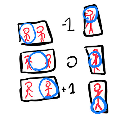
It took me longer to wrestle with this problem than I want to admit (I mean not THAT long, but still) - a few false starts where I thought maybe I had to treat portrait vs landscape separately. But the "aha!" moments (more like, "oh, right...") came from noticing that A. for simplicity we are assuming that at least one of the sides of the original image is the size of circle B. we can figure out the "ratio" of how much larger the original image was than the circle for each side C. those ratios tell us how much we have to shift the positioning of the whole image in order to get the circle back to where we want it.
(I actually added two masks for each image, one a half-filter for the whole image rectangle so we can see what the actual corners we have to work with are, and then the circle which is the end goal)
The heart of it is these two functions. The first one (I take care to preload() the images so we can get the reliably get the width and height of the raw images) makes the mask:
function makeMaskedImage(img, dir){
    const circleMask = createGraphics(img.width,img.height);
  // fill a soft mask so we see the whole frame,
  // for educational purposes
    circleMask.fill('rgba(0, 0, 0, .5)');
    circleMask.rect(0,0,img.width,img.height);

    const sz = min(img.width,img.height);
    const wRatio = img.width/sz;
    const hRatio = img.height/sz;

  //hard circle mask
    circleMask.fill('rgba(0, 0, 0, 1)');
    circleMask.circle(
        (sz * wRatio) / 2 + (dir * ((sz  * wRatio - sz)/2)),
        (sz * hRatio) / 2 + (dir * ((sz  * hRatio - sz)/2)),
    sz);
    img.mask(circleMask);
  return {img, wRatio, hRatio, dir};
}
"dir" - a value between -1 and 1 representing the offset of the circle from the center to the edge for the longer side - is kind of an aesthetic choice for each image, so it's a parameter. The calculated wRatio and hRatio are how long that side is relative to the size of the circle - so if the image was square to begin with, these would both be "1", meaning each side is as big as circle.
The math is fiddly, but basically says "put the circle in the center, then move it "dir" times one-half how much bigger that side is than the base circle. We then return information we will need to properly display it: the image itself (now with the masked affixed to it), the two ratios, and the "dir" indication which way (and technically how much, tho mostly -1, 0, or 1) the circle is offset from center along the longest side.
The drawing code then is
function drawMaskedImage(maskedImg, cx, cy, sz, ){
    const {img, wRatio, hRatio, dir} = maskedImg;
    const trueWidth = sz * wRatio;
    const trueHeight =  sz * hRatio;
    const xCenter = cx - (trueWidth/2);
    const yCenter = cy - (trueHeight/2)

    const xWiggle = ((trueWidth - sz) / 2) * dir;
    const yWiggle = ((trueHeight - sz) / 2) * dir;

    image(img,xCenter - xWiggle,yCenter - yWiggle,trueWidth,trueHeight);
}
Elsewhere in the code we make sure we're in rectMode(CENTER); a bit easier to deal with the middle of the image than work from the corners. We formulate the whole rectangular images dimensions at this arbitrary size sz, figure out the x and y center as if the circle was in the middle of that rectangle, then xWiggle and yWiggle figure out how to counterbalance the positioning of the rectangle in terms of the circle relative to it.
Phew! I don't know if there's a more elegant way but this seems pretty good to me.
Random Tangent:
I'm currently trying to figure out what I can learn from people who LOVE strongly typed languages, much more than I do. I mean, I wouldn't mind using typescript to describe what keys should be in {img, wRatio, hRatio, dir}, but here's the thing: as I evolved this code, at first I thought "dir" should be a fixed value, like "LEFT" or "TOP" or "CENTER", but then realizing that could also be 1,0,-1 - and in those cases do double duty as a math multiplier. (In fact, my new system would let me do other offsets, in case you didn't want the spotlight quite bumping up against one edge or the other.) Like I suspect someone who wasn't comfortable with loosely typed languages (as I am after decades of Perl and then Javascript) would have noticed that flexibility and possible repurposing so easily.


Great tutorial! Your explanation on creating and positioning circle images using CSS is both practical and easy to follow. It’s always refreshing to see design and development tips that help improve the visual appeal of a website without relying heavily on complex tools. For those working with web visuals, especially in eCommerce or design-heavy platforms, handling detailed images can be challenging. That’s where a professional image masking service can really come in handy. These services are perfect for refining product images or isolating complex subjects while maintaining a clean, crisp look that integrates seamlessly into web designs. It’s a perfect complement to front-end development work like yours. Thanks for the valuable content—looking forward to more posts like this!
ReplyDelete