Thursday, December 17, 2015

compute's gazette menus and the UX of 5 1/4" floppies: the historic review

My blog of COMPUTE's Gazette games is reaching the end of its run. COMPUTE's Gazette was a magazine for the Commodore 8-bit computers in the 1980s and early '90s, and I've been reviewing every "type-in" game they offered - over 300 items. I think my nostalgia for the magazine is largely driven by the fact I didn't have to type every game in - as a kid I was lucky enough to inherit a pile of the accompanying floppy disks with programs preloaded, and binary copies of those disks are what I've been using for my reviews.

Besides the reviews, I fill out up the blog by writing about what was going on in the industry (and bearing witness to the sad withering away of the Commodore community as PCs came to take over everything) as well as the UI of the disk itself. In some ways, it seems a little obtuse to be critiquing 30 year old UI, but I find it of historical interest to see what they did and of intellectual interest to think about how they could have done it better.

For the earliest issues, they didn't always get the loading quite right; the most canonical way of loading the "main thing" on disk (first in the directory listing) was
LOAD "*",8,1
But sometimes if it was a BASIC program, the ",1" would throw things off (the "8" was just the usual device number of the disk drive, and the "1" referred to loading it in memory like a binary program rather than as BASIC source.)

Still, the menu system was pretty decent, even from the earliest disks (Spring 1984):
They used the "function keys" - on Commodore computers, these were 4 big buttons on the right side of the keyboard. Oddly, you had to get to the even-numbered keys via hitting shift: F2 was "shift-F1", etc. That might explain why eventually they switched to to using numbers instead at the start of 1986:
A minor change, to be sure, but you appreciate it on modern Macs when you have to hold down the "fn" key to get the function keys back to their primeval jobs- I find it intriguing that function keys live on, but they've been repurposed and, on MacBooks at least, taken on specific specialty tasks (screen brightness, volume, multimedia controls - the multimedia controls seem a little odd and context-dependent to me, but hey.)

The deprecation of generic function keys represents progress in UX: we now prefer top level menu items, context menus, or keyboard accelerators. (Interesting that none of these are predominant features for modern touchscreen computing). It seems a lot smarter than the MS-DOS days of Word Perfect 5.1, where you might just slap this handy piece of plastic above your keyboard:
In a form of Stockholm Syndrome, regular users would grow to like these (and the program's "reveal codes" feature, kind of like looking at the HTML source of a webpage, was very useful, but again not great for new users) but clearly we live in a friendlier time.

So, back to Gazette... the menu was all well and good until February 1991 when they unleashed this upon their audience:
This was an era where GEOS, a GUI system, was gaining some popularity, and let the Commodore act more like the Mac/Windows machines, and so they probably tried to take a cue from that. It's an odd choice though: you could use the joystick or the arrow keys (or the mouse if you had one - I think, they were never a big part of the culture) to shove the cursor key around, but it never felt like a natural thing for the system.

Making it worse, to get to the main function of the menu program (i.e. loading the other programs) you had to go to "Monitor" and then "Directory". The next month they improved things a smidge in that the directory listing would automatically load:
Still the whole "Gazette Operating System" is of dubious value. The C64 had a notoriously slow disk drive, and waiting for all this extra crap to load was surely a frustration. (The only thing I can think of with any value are some of the options in the Disk menu, like formatting.) Plus, there just isn't the sophistication of design for employing any keyboard shortcuts: the arrow keys are too busy shoving the pointer around to allow easier navigation from the listing.

This unfortunate era lasted 2 years, and in March of 1993 they were back to text-based, numeric menus.

The last change to their menu system happened when they switched to being a disk-only proposition (they had already lost their standing as an independent publication and were merely a cheap-paper supplement in their parent magazine COMPUTE) For three months, the menu lead off with this return to function keys:
There's an air of pathos in leading with "Advertising"; on the other hand this was an era where Commodore stuff was probably almost impossible to find in retail stores, so there might have been a bit more value to the reader than it first appears, but not much. Anyway, each of those top menus lead to the old reliable numeric menus.

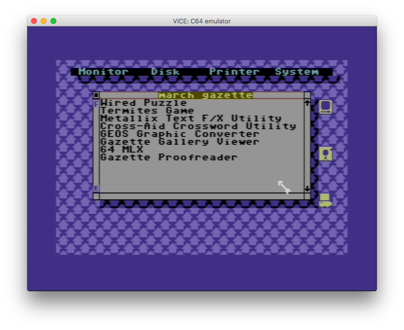
By March they replace this (possibly slower loading? And I wonder if they crafted the large month and year graphic by hand, or had an automated system...) with a humbler version of their old standby:
And that's pretty much where it would stay for the remaining year of publication.

("Press X to Return to BASIC"... I have said before that this era of computers was special to me, in part because using an accessible programming language as a bootloader was so empowering, an invitation for kids and adults alike to make something...)

So a final note before wrapping up. With the switch to disk only (actually before, when they started including bonus programs on disk that they didn't have the page space to print as type-in listings) they were reliant on a text reader program for providing program details or for article content. So for a program you would get through this screen:
and invariably to this reminder of how to use the reader:
It seems to me that that's poor UX, even for the era. I think putting a permanent menu bar on inverse text at the top, with a reminder of the cursor keys and then "O" or something for a menu of options (like changing colors or printing) would have been a lot cleaner. Also, I'm a little surprised they didn't provide a simple "page down" key, like space or return. Cursor keys are the only option, and while they happen to scroll text at a reasonably human rate, it seems like an odd lack, given that the "more" command had been around for over a decade and a half at that point.

The other final thing: I give them kudos that the text reader is pretty well integrated to the menu program, in that when you hit M to go back to the menu, you don't have to wait for disk access, it has stayed in memory. But then to get back to the main menu from the submenu, you hit X instead (and usually there is disk access) - just an odd bit of asymmetry, probably reflecting a programmer's shortut.

So there it is, a decade of Commodore menu UI. It was a fun time... and reviewing these games is some of the most pleasant video game activity I've had all year.


No comments:

Post a Comment