

Thursday, June 27, 2013
on human wrists and instagram
While TV and computer screens have moved from 4:3 to 16:9, the 1:1 square crop is going to be more important in amateur photography and video, in part because it's more natural and comfortable to hold a phone upright when taking photos and especially video, and because portrait-mode video looks a bit daft.

Wednesday, June 19, 2013
UI HALL OF SHAME: The Kindle App
Alright, this is less "hall of shame" and more "time for Kirk to gripe", but...
The Amazon Kindle application is pretty decent. One thing that bugs me though is it has no way of categorizing books... it just shows them as one big pile with few sort options. People have been asking for this feature for years, and it's present on the Desktop app and some of the physical devices, but for some reason Amazon doesn't think it's a worthy addition. (Personally, I don't want to obsessively sort stuff, just establish a "read this sometime" pile.)
Here's another thing: the app has a decent enough "progress bar" showing where you are in the book, but it's always the full, cover-to-cover content of the book. Some books have giant indexes or reference sections that no one is going to page through, but it still counts against the current progress. And the thing is, I know that the books have a concept of "beginning and end of the main content" because A. it annoyingly hops me to "page 1" when I open a new book, sometimes bypassing interesting covers and dedications and introductions and B. it also annoyingly pops up a "rate this book!" dialog when I finish the last page of the main content. (Again, I think the older devices handled this a little better, with little markers on the scrollbar showing where various chapters begin... better than the generic single-value scrollbar the apps use.)
As a developer, I try to have an understanding of the cost of features... nothing comes for free, sometimes there are hidden complications or competing factors, and everything takes development hours and QA, but still it's frustrating when the "bang for the buck" ratio seems pretty good and nothing is done.
Tuesday, June 18, 2013
excellent high level analysis of what we are seeing in the iOS7 beta release
http://mattgemmell.com/2013/06/12/ios-7/ is a really excellent overview of what are the likely goals of the changes in iOS7
Sunday, June 16, 2013
online tool for IP fun: xip.io
I haven't quite figured out when it will be useful to me, but http://xip.io/ seems like a good idea... using DNS wildcarding, it lets a developer hit any IP as if it were a remote URL. I think this would be good for development where a script hitting "localhost" provokes different results than a remote server.
Thursday, June 13, 2013
quick thoughts on iOS7
FWIW, I rolled back to iOS6 after having the dev build of iOS7 on my iPhone for a day. It was nice having a peek into the future, and fun to see how the sausage is made at Apple, but not worth dealing with instability, at least not for my day-to-day phone. The two bugs that pushed me back were 1. The calendar view woud sometimes duplicate events to the next day. 2. I kinda rely on my smart, "recently added" playlist to be able to play in reverse chronological order, and for some reason iO7 would only do oldest first.
It was fun, though. One of my favorite features, relatively unheralded, was a written description of the upcoming day:
 That really maps to how I think... written words can be skimmed and reviewed in a way that spoken words can't, and they are flexible and expressive in a way hieroglyphics and pictograms generally aren't.
On the other hand, on both the Calendar view there and in the new app, the day is written out in a very boring fashion. For people like me who have sparse calendars, like 1 or 2 hour-ed out events per day, it's foolish and annoying to have to scroll so much.
The old Palm Pre had a more clever idea:
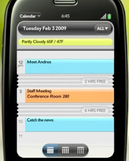 What's happening there is long stretches of the day are visibly "accordioned" into a fix size. (Also on iOS7 the Calendar app didn't seem to have a "list view" that is conceptually kind of similar, though if hit the magnifying glass to do a search, before you entered terms you had something very much like the old list view.) Given some other Palm features iOS seems to be borrowing from (like the full screen thumbnails in the multitask view), it would be cool for them to grab this one as well.
One final nitpick, though this might just be a "growing pain" that will go away... here's the current iOS7 lock screen:

It says "slide to unlock" but... which way? The answer is "to the right". This feels absolutely backwards to me... often the first screen I see is the first page of the homescreen, and it has more screens to its right. Mentally, I would therefore place the lock screen "to the left" of the homescreens. With this arrangement, it seems like the second page of the homescreen and the lock screen occupy the "same space".
The reason why it's like that is explained by this iOS6 screen capture:
.PNG)
They've kept it the same, because either they don't share my mental modeling, they were lazy, or they thought people were so used to the old slider that they didn't need to tell people any more.
It was fun, though. One of my favorite features, relatively unheralded, was a written description of the upcoming day:

On the other hand, on both the Calendar view there and in the new app, the day is written out in a very boring fashion. For people like me who have sparse calendars, like 1 or 2 hour-ed out events per day, it's foolish and annoying to have to scroll so much.
The old Palm Pre had a more clever idea:

One final nitpick, though this might just be a "growing pain" that will go away... here's the current iOS7 lock screen:

It says "slide to unlock" but... which way? The answer is "to the right". This feels absolutely backwards to me... often the first screen I see is the first page of the homescreen, and it has more screens to its right. Mentally, I would therefore place the lock screen "to the left" of the homescreens. With this arrangement, it seems like the second page of the homescreen and the lock screen occupy the "same space".
The reason why it's like that is explained by this iOS6 screen capture:
.PNG)
They've kept it the same, because either they don't share my mental modeling, they were lazy, or they thought people were so used to the old slider that they didn't need to tell people any more.
Tuesday, June 11, 2013
PROTIP: iOS 7
PROTIP: if you download a developer preview of iOS 7 (and this might apply when they release to everyone) take screenshots of your homescreen(s) (home button + power button), if you're one of those people who likes having their icons in certain places... the install doesn't preserve those very well.
So yeah, I used my developer license to become an early adopter of this. (Here's a decent rundown of many of the changes) It's clearly still a work in progress, but not bad over all. The glamour feature where the background behind screens moves independently, give an illusion of depth, is really clever. I mean, even the SNES could do that kind of parallax scrolling, but it was smart to put it in there.
So yeah, I used my developer license to become an early adopter of this. (Here's a decent rundown of many of the changes) It's clearly still a work in progress, but not bad over all. The glamour feature where the background behind screens moves independently, give an illusion of depth, is really clever. I mean, even the SNES could do that kind of parallax scrolling, but it was smart to put it in there.
Wednesday, June 5, 2013
Phantom.js : awesome tools for web screenshots from the console
Sometimes a web technology comes around and you say "Wow- I didn't know they could do that these days." Early Google maps was one example of that: being able to pan around a larger-than-the-window photo excerpt by mouse dragging was a revelation.
Phantom.js is another example of that. It makes it really easy to make a "headless" web browser, with the full power of WebKit (the engine behind Chrome and Safari.) So you can have a page that will execute all the javascript and other things, and then you can have it make a "screengrab".
I admire how easy they make it to set up and use (I was looking at a bunch of packages for doing simple node/edge chart making, and NONE of them had a simple "here's how you go from zero to Hello World" page.) The Downloads page was simple enough (I recommend getting Homebrew for OSX if you haven't already) and then the Get Started page walks you through some simple but awesome examples... the second one is a "make a screenshot" and it's as simple as making a "runme.js" file containing

Man, that's great. I can think of a lot of uses for that, like helping to automate testing or just keep track of a webpage's look and feel over time.
Phantom.js is another example of that. It makes it really easy to make a "headless" web browser, with the full power of WebKit (the engine behind Chrome and Safari.) So you can have a page that will execute all the javascript and other things, and then you can have it make a "screengrab".
I admire how easy they make it to set up and use (I was looking at a bunch of packages for doing simple node/edge chart making, and NONE of them had a simple "here's how you go from zero to Hello World" page.) The Downloads page was simple enough (I recommend getting Homebrew for OSX if you haven't already) and then the Get Started page walks you through some simple but awesome examples... the second one is a "make a screenshot" and it's as simple as making a "runme.js" file containing
var page = require('webpage').create();
page.open('http://alienbill.com', function () {
    page.render('alienbill.png');
    phantom.exit();
});
and then hitting
phantomjs runme.js

Subscribe to:
Posts (Atom)