FWIW, I rolled back to iOS6 after having the dev build of iOS7 on my iPhone for a day. It was nice having a peek into the future, and fun to see how the sausage is made at Apple, but not worth dealing with instability, at least not for my day-to-day phone. The two bugs that pushed me back were 1. The calendar view woud sometimes duplicate events to the next day. 2. I kinda rely on my smart, "recently added" playlist to be able to play in reverse chronological order, and for some reason iO7 would only do oldest first.
It was fun, though. One of my favorite features, relatively unheralded, was a written description of the upcoming day:
That really maps to how I think... written words can be skimmed and reviewed in a way that spoken words can't, and they are flexible and expressive in a way hieroglyphics and pictograms generally aren't.
On the other hand, on both the Calendar view there and in the new app, the day is written out in a very boring fashion. For people like me who have sparse calendars, like 1 or 2 hour-ed out events per day, it's foolish and annoying to have to scroll so much.
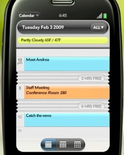
The old Palm Pre had a more clever idea:
What's happening there is long stretches of the day are visibly "accordioned" into a fix size. (Also on iOS7 the Calendar app didn't seem to have a "list view" that is conceptually kind of similar, though if hit the magnifying glass to do a search, before you entered terms you had something very much like the old list view.) Given some other Palm features iOS seems to be borrowing from (like the full screen thumbnails in the multitask view), it would be cool for them to grab this one as well.
One final nitpick, though this might just be a "growing pain" that will go away... here's the current iOS7 lock screen:
It says "slide to unlock" but... which way? The answer is "to the right". This feels absolutely backwards to me... often the first screen I see is the first page of the homescreen, and it has more screens to its right. Mentally, I would therefore place the lock screen "to the left" of the homescreens. With this arrangement, it seems like the second page of the homescreen and the lock screen occupy the "same space".
The reason why it's like that is explained by this iOS6 screen capture:
They've kept it the same, because either they don't share my mental modeling, they were lazy, or they thought people were so used to the old slider that they didn't need to tell people any more.


.PNG)
No comments:
Post a Comment