Sunday, January 30, 2022

on the ux of popcorn nutrition facts

I know I've griped about this before, and too tired to make a "funny" meme, but Stop N Shop "Nature's Promise Organic Microwave Popcorn".  Nutrition Facts sends me. "About 7 servings per container". Referring to... the 3 damn bags in there. You know, for that excellent 2 1/3 serving per bag - perfect for.... you and your partner and 1/3 of a friend, I guess?

I just despise this obfuscating horeseshit.  "130 Calories Per Tbsp. Unpopped. 30 Calories Per 1 Cup Popped" Thanks for using 2 columns for semi-relevant nonsense. Maybe I should start eating unpopped? Is that a thing?

Start with the assumption that someone will eat a whole bag, or if they are splitting (and actually give a damn) can calculate what fraction of the bag they are wolfing down. Not this "2 1/3 Servings" Malarky. Jeezie Petes.


Thursday, January 27, 2022

cute css trick for formatting footnotes

One challenge when you have content loaded from JSON translation files - in React, there might not be a graceful way of allowing <em> and <b> and other purely stylistic markup; you either have to hack something to wrangle the structure or you use dangerouslySetInnerHTML and hope that your code is never used with unsanitized user data.

A late addition to the design was footnotes; because the footnote also needed to be separate markup (for coloring purposes) my code (with asterisk as a boolean was like

    <headercardfooter href="{url}">
      {asterisk &amp;&amp; <asterisk>*&nbsp;</asterisk>}
      {text}
    </headercardfooter>

which along with some coloring for asterisk (we're using styled components) got me to:


But that's not great. But the trick was as simple as changing the headercardfooter from display:block; to display:flex; - all the defaults for flexbox are such that you get 

practically for free!

Thursday, January 20, 2022

interview with wordle creator and thoughts on its ux

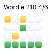
 If you're on social media there's a good chance you've seen people the telltales of people playing Wordle:

Here is an interview with its creator Josh Wardle.

I adore the UX of this thing:

  1. The limit of one word a day turns it into a social event - everyone is talking about the same challenge, and it's not out to encourage endless bing playing. It's a satisfying little mind snack on the daily
  2. The interview talks about the sharing widget - it's so lovely that it doesn't have a link and so doesn't generate one of those obnoxious link badges (I think the backlash against these would be even stronger if they were more direct linkage and less enigmatic.)
  3. With that widget, you can read the tale of a victory... and if you've succeeded on the day's yourself, you can have fun trying to guess what people's first word might have been
  4. The keyboard that lights up with what letters are left and which ones are in use is great
  5. The one-letter-at-a-time reveal is well-done... just a tad bit of suspense tension-and-release about where you are in the game after you've made a good guess..
There is some backlash to the ubiquitous shares of it, and understandably so. I don't make any posts about my success or challenges, but I do comment on others'.

Tuesday, January 18, 2022

note to self: technology to look at

I want to look at remix and preact. Oh and I've had some previous success with parcel for bundling stuff up...

Monday, January 17, 2022

todo triage: hot tasks, the daily routine, the long term

Quote of mine from a decade ago:

My Todo app is blocked with some dumb old tasks I really need to get around to. I call this condition "procrastipation".

I had forgotten that term, but the struggle continues! It's so bad when the todo list is so full that you avoid looking at it. 

So I wrote about the Palm PDA the other day, my first (more or less) digital tool for wrangling this stuff,  because I was curious if it even had Todo items with due dates. (Answer: nope, though it had a great datebook.) And so if it didn't have "due dates", it wouldn't make sense for it to have "recurring items", since it wouldn't know when to put the item back on the list. And frankly, it's that "Pete+Repeat" section that was the problem with my use of the 2Do app: the dozen or so tasks I like to make sure I do every day made up a big block interfering with my view of other tasks. 

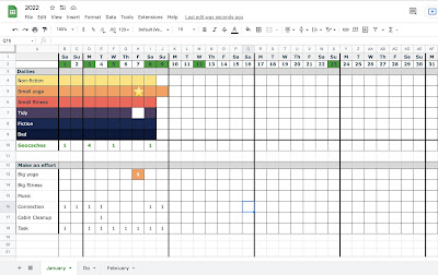
By chance my friend Sophie mentioned her New Year's resolution of using a spreadsheet she to keep progress with her daily routines:


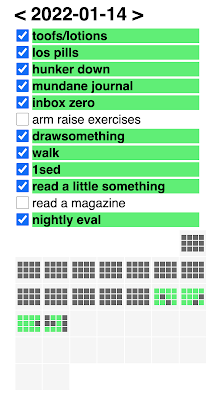
and that made me realize I should rethink my own approach to the daily grind. I'm mildly allergic to spreadsheets, but I do love making UIs, so I came up with this:
("Toofs" is more about flossing than anything... I generally don't have a problem remembering to brush my teeth.)

So Sophie's color code got me to make the checkbox item itself go green, and damn is it satisfying! It has the same kind of energy as Apple's Fitness Watch "complete the rings"... and thinking about it, that kind of structured building up (with the items always in the same arrangement, roughly chronological in the course of a day) feels so much better than just clicking a todo item so it goes and hides until the next day.  My new system has a sense of positive progress vs just the absence of nagging of my old system.

I also made an abstract "month" view underneath to build a sense of continued maintenance - you can absolutely tell this was designed in the time of Wordle and its infamous emoji (and, super-clever, and delightfully not-a-URL) shareable game descriptions:

(I used this css-tricks page for notes on the PHP to construct the calendar - but I really do need to get some javascript engines working on my server...)

So I think the next step might be to offload the long-term Todo items into external lists. Luckily 2Do has support for multiple lists (on a single scrollable panel) so they're not really interfering with my more urgent material, but I think it would be nice to have an app just for the stuff demanding more immediate attention, and less of the longer term project stuff. 

But yeah, I think my mistake was looking for one app to rule them all... new/urgent tasks, daily repeating items, and long term projects all have a bit of a different feel. And actually using different apps for them helps engage "muscle memory" in different ways.

FOLLOWUP: After building this and using it for a week, I realized I should have looked in the App Store for something similar. And indeed, there's stuff like Habit that looks pretty good, has nice Widgets even. But playing with it, I think it's more complicated than I want to deal with, and I like that my solution works well on my phone and on a browser on my laptop. 

Sunday, January 16, 2022

lotus agenda

Just a note to my future self, because I feel like I might be on the verge of forgetting... an old collaborator Len was a big fan of Lotus Agenda - its free form data entry and tagging was apparently way ahead of its time, and fans of it struggle to find its equal.

the zen of palm, a browser-based palmos emulator, and the handspring

I've previously expressed my love for the mid-90s PalmPilot. Having a gadget to offload details from my brain was just amazing - I kept a precursor to my blog on it and really fell in love with its Date Book and To Do app. 

Cloudpilot is a fun, browser-based emulator for it. You have to download its ROM from PalmDB but then it is ready to go. It is amazing what they got into a 160x160 square - admittedly around the resolution of the gameboy (that was already about 7 years old by then) but with the stylus-based character recognition and ability to synch with your desktop, it was a serious information tool that improved my quality of life. 


You can dig up a copy of Zen of Palm on the Internet Wayback Machine - it's a brisk read about how to make great user experiences on such constrained devices. Some of what it says how people use handhelds is now outdated - back then things were optimized for utilitarian quick-hits of information, while now too often the drive seems to be "how do we get people using this for hours and hours" - but many of the core ideas of distilling to the essence of the usecase still apply (Q: How do you fit a mountain in a tea cup? A: Extract the diamonds and leave the rest.) One interesting nugget I hadn't heard before: 

Iterative user testing was a critical factor for the success of the original Palm Powered handheld. The software designers actually did several prototypes of the entire user interface in HyperCard before writing code.

I do wish I had run into HyperCard when it was a going concern. 

Finally, making the rounds is Springboard: the secret history of the first real smartphone, an excellent way to spend half an hour (or less if you watching things sped up...)

(FWIW, which isn't a lot, while I respect how Handspring moved the market, that first Visor seems so ugly to me - that very of the moment iMac-ish transluscent plastic didn't actually show you much of interest, and the square design with those unpleasant side ridges... bleh!)

Anyway, The Talk Show of Daring Fireball had an episode talking with the maker of the documentary

Saturday, January 15, 2022

Friday, January 14, 2022

conic gradiants for pi charts?

 Huh. Conic gradiants aren't just for color blends, apprarently!


Tuesday, January 11, 2022

a good programmer is hard to find

 I think this slashdot discussion Why Do Programmers Make So Many Mistakes? misses some of how at least sometimes the best is the enemy of the good, but still some fun reading.  The difficulty of finding candidates who could even do FizzBuzz matches some bits of my experience. Also nice seeing Falsehoods Programmers Believe About Names joined with a new friend Falsehoods programmers believe about time.

Monday, January 10, 2022

all the pretty (dangerous) colors

A while back I posted about a hypothetical trojan horse indicating a fundamental vulnerability in how people implicitly trust npm packages. 

Lately, the geekosphere is abuzz with Dev corrupts NPM libs breaking thousands of apps.

Oddly enough, both that hypothetical(?) exploit and the current shenanigans involve "get colors in your javascript logging".

Sunday, January 9, 2022

introducing blogallery, a super lightweight, zero-config vanilla javascript providing progressive enhancement for an image gallery and full screen viewer

I am a dedicated amateur photographer, and I've decided that I like my blog as my "source of truth" for photos. (Also, in an era where amateur photograph is leaning towards "what looks impressive on a phone screen", it's truly a pleasure to be able to open up an image full screen on a generous monitor - you can really sink into the detail.)

A while back I made up some CSS and js for nice thumbnail galleries. If the HTML was simple links wrapping images for a scrollable column, maybe looking like this: 

then I could change it into a thumbnail gallery like this via CSS:

using "scrollIntoView()" to go to the larger issue when a specific image was clicked. And I had each of the "full-width" images link to the original, giant image. But it was always kind of weird that you couldn't, like, use arrow keys to get to the next image in the set.

But now there is... BLOGALLERY!!!

Now simple HTML like
<div class="blogallery">
  <h2 class="blogallery-caption">Open Photo Gallery</h2>
  
  <a href="IMG1-FULLSIZE.jpg">
    <img src="IMG1-INLINE-SIZE.jpg">
  </a>
appears with the same thumbnail gallery, and still opens up into the scrollable column view, but then each image clicks into a full screen viewer, with clickable arrow and keyboard controls:
It also supports images without links, and images in the <figure> tag and will show the <figcaption>s in a reasonable way. No code (or build system) needed (or currently supported) - just include the .js and .css file and document ready hunts for the "blogallery" class.

Some minor cleverness in terms of using object-fit: contain; for the image, and also using a background-image for the image of the scrollable column (lower-rez) image. 

You can see it action at my Photos of the Year tag page (and see some interesting (IMO) photos as well!)

Friday, January 7, 2022

it's not NOT rocket science...

Inspired by this XKCD comic (and also this one and its explanation) I was reading up on James Webb Space Telescope... I stumbled on this FAQ:

How is testing different for Hubble and Webb's mirrors? What did Hubble teach us?

First, on Webb, we used completely separate sets of measurement tools and techniques for verification than what we used to guide manufacturing. This avoids one error from the Hubble experience where the same tool used for manufacturing was later used for verification.

Ha! Sounds a lot like developers writing their own tests...

Thursday, January 6, 2022

javascript fights on

 Interesting view of some of the contenders of the throne occupied by Javascript - spoiler of bits from the the conclusion:

It has shocked me how many body blows this language has taken over the years and still it stands, like a bruised boxer in the ring.

But as my friend and business partner Scott Shattuck says, one reason is “Location, location, location”.

JavaScript’s position as the only language built into the web browser ensures its longevity. With billions of web pages depending on it, JavaScript will likely outlive everyone reading this article.

And I know I'm an old scripting cowboy barbarian at heart, but that's why I am very slow to adopt pre-processors and other build systems, and prefer to live with what is easy to do in the browser itself: it's just so stable. My knowledge can build up with much less throwaway expiration...

bugs and transparency

BSoD to Watson: The Reliability Journey

Great piece on the history of early computers- when the new multitasking GUIs were more prone to failure than earlier, simpler systems but the industry hadn't developed best practices around them, up through allowing computers to send useful error reports back home via the Internet.

As always, I think the key is always making things as transparent as possible.

As happy that another Kirk - Kirk Glerum - played such a major role.

Sunday, January 2, 2022

the joy of bookshelves

Ian Bogost on why Ebooks Are an Abomination (The title is a bit more combative than the conclusion; I suspect it might have been retroactively goosed up by an editor to be more click-bait-y)

I think he misses one of the main appeals of physical books; how they sit on the shelf after the main reading is done. Perhaps I'm a bit superficial but I value full bookcases as a reminder to myself (and a sign to visitors) of my history with and ongoing relationship to the printed word. Bogost addresses the physicality of print books as they are read, but on a shelf that physicality is equally even more significant; the shape and color and typography cement a book more firmly in bodily memory, as does the physical location on well-established, stable personal set of bookshelves.

And of course, a set of bookshelves can become a personal lending library in a way a bunch of books in a ebook device won't. Physical books are much more readily shared.

(And as an extension of that - physical books can support local booksellers. I bought a novel of an author I like from the window of Arlington's "The Book Rack" yesterday in part to do a small bit to help that continuation.)

All that said, I still do most of my reading on iPads. I've never liked the murky-gray of Kindles, my lightly astigmatic eyes prefer a backlit screen and it's great to be able to read in a dimly lit room without having to carefully balance an external light source.

(Back to the vanity of it: when someone sees you reading a physical book, they know you're not just dinking around on social media on your iPad or phone, so that's a plus for a social creature as well.)

Bogost claims ebooks are inferior for highlighting and marginalia, but I think iPads more than make up for that with multiple colors of highlighting and for copy and pasting passages - important for someone who thinks brief paragraphs can punch above their weight in content, and likes to capture those, either in a commonplace book or publically in a blog or on social media.

I'd say Bogost doesn't quite nail the dividing line of what genres work well as ebooks; there's a lot of non-fiction that is still pretty linear and fits the format well.

(Also, Bogost seems to mix electronic texts that reflow content vs PDF scans - I assume he knows but doesn't call out that margins are also useful to keep line lengths reasonable, and prevent the eye from having an excessively long journey across and back.)

Sometimes I try to split the difference then, doing most reading on my iPad (or sometimes now my large screen iPhone - but I'm sure Bogost would share my concern that it puts content in magazine-esque column widths, which is a bad vibe for much reading.) But if a book really strikes home, I like to ask for a copy of the print form for the shelf. The best of both worlds, potentially, though maybe a little unseemly to have a shelf with so many pristine, uncracked books there among the more well-worn editions.