I generally like Apple's UI, but here are two long-standing problems in iOS.
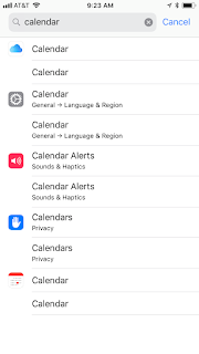
One is, while the idea of a search box in Settings is great (since the hierarchy can be tough to remember and navigate) the implementation is so poor it's almost useless.
My use case: iOS Calendar sometimes gets confused if someone cancels or moves an Exchange meeting you've just accepted - frequent popups would recur saying it can't accept it. The only way I've found of fixing that is to disconnect the phone from the Exchange Calendar service (doable via a simple toggle switch, once you find it) then reconnecting it.
But where in Settings to do that? A search for "Outlook" or even "Exchange" comes up with nothing, even though "Exchange" is one of the panels under "Accounts & Password". So what if I look up Calendar? I get this result:
I don't think any of those are what I'm looking for. Using the magic word "Accounts" gets you there, sort of, but even then it's a redundant mess.
Another issue with the Calendar is that it's way too easy to put something on the wrong day - I've seen many people make the same mistake I do all the dang time. Why?
If you're using the list view (far and away the best way of seeing a week if you have a schedule that isn't jampacked) and hit "+" to add a new event, it's a bit hit or miss what day the dialog will default too - the day that's pressed up against the top of the scrolling view, and quite possibly not the one you're actually looking at. But once the dialog opens, the "Starts" field just lists the date, not the day of the week.
When you edit the field, the tumbler has the day of the week listed, but as you can see here above the tumbler (they highlight it in red) they didn't think it was important enough to put in the form field itself:
Having the day of the week listed in the field would be much more useful than the year. Because the day of the week isn't listed, many people quickly adding an event might assume the day they were focused on in the list view is where the event landed, and forget to check.
Four years ago I complained about the weird "statefulness" of the iOS Calendar views. I've internalized that so it's no longer a problem, but still - not having the day of the week always visible is just plain bad UX.


No comments:
Post a Comment