Wednesday, December 30, 2015

on hashchange, on jQuery, on donner, on blitzen

Some coders take on large frameworks because they like some of the features provided - but some of those features can be easily duplicated in systems that have less conceptual overhead, such as jQuery.

One of those features is hash anchor driven navigation, which is pretty decent way of making a one-page-app with back button support, so long as you start with hash page control from the outset and not try to glom it on after.

All you need to do is set up a listener on the window hashchange event:
$(function() {
    $(window).bind('hashchange', hashChanged);
});
(remember that's the short hand for $(document).ready()... I'm not sure that it's not too concise for its own good, frankly.)

Then, your hashChanged function can do whatever it wants with the new value:
function hashChanged(){
    var hash = window.location.hash.slice(1);
    console.log(hash);
}

You can set that hash value programmatically:
window.location.hash = 'someValue';
or you can do it in the DOM, like in a link:
<a href="#someOtherValue">let's go</a>

This is the kind of high-transparency, low-conceptual-and-code overhead coding style I tend to go to for small applications, and maybe even medium-sized ones. Obviously, the actual guts of your hashChanged function can get complex and tangled if you let it, but this is a good building block to know- if you'd rather just install a nice kitchen than buy the whole house.

Saturday, December 26, 2015

graph paper days and in-browser transparent png via p5.js

My personal blog ( http://kirk.is ) has been long overdue for a makeover.

For posterity, you can see it's pre-makeover look on the Internet Archive Wayback Machine. I can always tell old HTML of mine when the tags are in all-caps. (<A HREF="http://kirk.is">like this</A>) I've switched, of course, but I still secretly think all caps tags were a bit more readable, standing out more from mixed-case content than the modern xhtml-influenced style.

So I wanted my (15 year old!) daily blog to look like the modern web, which also included simplifying it and making Alien Bill Productions my main "creative works" repository. For what it's worth, I've decided on the simplicity of kottke.org as my main layout influence... but I thought I'd like to make a nice logotype for the header, one influenced by the graphpaper font doodling of my highschool years. (And more recently: graph paper moleskine notebooks are kinda hipster awesome, carrying and using one makes me feel like a more creative person.)

I made a p5.js program to generate some experimental layouts -
The bottom two are the same as the first two, but with a shaded background effect. Ultimately, I'm going to run with the third on the list.

The code is hacky. I switched to p5.js after starting in processing because JSON is so much easier to tool around with than Java HashMap static initializers... The shading is a bit handcoded, because I wanted to let the "graph paper" background show through, so the hidden line removal was trickier than if I draw lines at every vertex and then made the letter fronts opaque polygons.

When I decided to make a version to use on the site, at first I thought I'd just do a screen grab of the webpage, but that meant the transparency info was lost. I was surprised and delighted to see the p5.js has support for generating transparent pngs, that can then be automatically downloaded as a file. The trick is to use clear() instead of the usual background(255) and then do something like saveCanvas("MyImage","png") - and of course, you don't want to put that in a draw() routine being called 60 times a second!

(Oh, and for what it's worth, I updated this blog's p5.js boilerplate to have two examples: one (quick-hack-friendly and more "Processing" like) that pollutes the global namespace and slaps its own canvas on the webpage, and then one that's my original sample code that plays more nicely with a more complicated webpage - everything is properly namespaced, and you can control the canvas tag CSS etc, but you have to prefix API references.)

Anyway. Making a jpeg or transparent .jpg is one of those "oh, I didn't realize a browser could do that" kind of things, like the copy and paste in image right into chrome trick.

UPDATE: Here's one I made just now (October 2016) for this site:

Monday, December 21, 2015

layout matters so very, very much

Steve Harvey misread the final card for the Miss Universe pageant and Miss Colombia had to relinquish her crown to Miss Phillipines... a humiliation for all concerned, but especially for whoever put this piece of crap card together:
Humans make assumptions when they take in information visually: they subconsciously expect things to fall in patterns and rhythms, and making text big and bold doesn't always emphasize: in fact the opposite - it can cause things to be mentally labeled as unimportant background context.

(My friend Josh brought my attention to something I had missed: ELMININATION ?? Man, what a lousy job all around.)

Of course, one of the most infamous examples is the Florida 2000 Election "Butterfly Ballot":
People made assumptions about alignment and spacing and correlation, and so we got Elderly Jewish Reitirees for Buchanan, aka "Pitchfork Pat" - an absolute statistical and demographic anomaly. Because of this terrible layout Florida's electoral votes went to Bush and the popular vote was over-ridden. It is not too much of a stretch to say that the Middle East would look very, very, very different today if someone if someone had been better at their job.

Thursday, December 17, 2015

compute's gazette menus and the UX of 5 1/4" floppies: the historic review

My blog of COMPUTE's Gazette games is reaching the end of its run. COMPUTE's Gazette was a magazine for the Commodore 8-bit computers in the 1980s and early '90s, and I've been reviewing every "type-in" game they offered - over 300 items. I think my nostalgia for the magazine is largely driven by the fact I didn't have to type every game in - as a kid I was lucky enough to inherit a pile of the accompanying floppy disks with programs preloaded, and binary copies of those disks are what I've been using for my reviews.

Besides the reviews, I fill out up the blog by writing about what was going on in the industry (and bearing witness to the sad withering away of the Commodore community as PCs came to take over everything) as well as the UI of the disk itself. In some ways, it seems a little obtuse to be critiquing 30 year old UI, but I find it of historical interest to see what they did and of intellectual interest to think about how they could have done it better.

For the earliest issues, they didn't always get the loading quite right; the most canonical way of loading the "main thing" on disk (first in the directory listing) was
LOAD "*",8,1
But sometimes if it was a BASIC program, the ",1" would throw things off (the "8" was just the usual device number of the disk drive, and the "1" referred to loading it in memory like a binary program rather than as BASIC source.)

Still, the menu system was pretty decent, even from the earliest disks (Spring 1984):
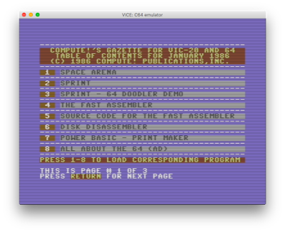
They used the "function keys" - on Commodore computers, these were 4 big buttons on the right side of the keyboard. Oddly, you had to get to the even-numbered keys via hitting shift: F2 was "shift-F1", etc. That might explain why eventually they switched to to using numbers instead at the start of 1986:
A minor change, to be sure, but you appreciate it on modern Macs when you have to hold down the "fn" key to get the function keys back to their primeval jobs- I find it intriguing that function keys live on, but they've been repurposed and, on MacBooks at least, taken on specific specialty tasks (screen brightness, volume, multimedia controls - the multimedia controls seem a little odd and context-dependent to me, but hey.)

The deprecation of generic function keys represents progress in UX: we now prefer top level menu items, context menus, or keyboard accelerators. (Interesting that none of these are predominant features for modern touchscreen computing). It seems a lot smarter than the MS-DOS days of Word Perfect 5.1, where you might just slap this handy piece of plastic above your keyboard:
In a form of Stockholm Syndrome, regular users would grow to like these (and the program's "reveal codes" feature, kind of like looking at the HTML source of a webpage, was very useful, but again not great for new users) but clearly we live in a friendlier time.

So, back to Gazette... the menu was all well and good until February 1991 when they unleashed this upon their audience:
This was an era where GEOS, a GUI system, was gaining some popularity, and let the Commodore act more like the Mac/Windows machines, and so they probably tried to take a cue from that. It's an odd choice though: you could use the joystick or the arrow keys (or the mouse if you had one - I think, they were never a big part of the culture) to shove the cursor key around, but it never felt like a natural thing for the system.

Making it worse, to get to the main function of the menu program (i.e. loading the other programs) you had to go to "Monitor" and then "Directory". The next month they improved things a smidge in that the directory listing would automatically load:
Still the whole "Gazette Operating System" is of dubious value. The C64 had a notoriously slow disk drive, and waiting for all this extra crap to load was surely a frustration. (The only thing I can think of with any value are some of the options in the Disk menu, like formatting.) Plus, there just isn't the sophistication of design for employing any keyboard shortcuts: the arrow keys are too busy shoving the pointer around to allow easier navigation from the listing.

This unfortunate era lasted 2 years, and in March of 1993 they were back to text-based, numeric menus.

The last change to their menu system happened when they switched to being a disk-only proposition (they had already lost their standing as an independent publication and were merely a cheap-paper supplement in their parent magazine COMPUTE) For three months, the menu lead off with this return to function keys:
There's an air of pathos in leading with "Advertising"; on the other hand this was an era where Commodore stuff was probably almost impossible to find in retail stores, so there might have been a bit more value to the reader than it first appears, but not much. Anyway, each of those top menus lead to the old reliable numeric menus.

By March they replace this (possibly slower loading? And I wonder if they crafted the large month and year graphic by hand, or had an automated system...) with a humbler version of their old standby:
And that's pretty much where it would stay for the remaining year of publication.

("Press X to Return to BASIC"... I have said before that this era of computers was special to me, in part because using an accessible programming language as a bootloader was so empowering, an invitation for kids and adults alike to make something...)

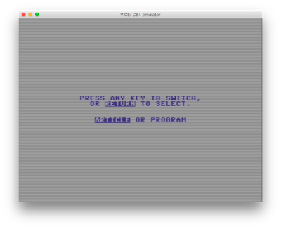
So a final note before wrapping up. With the switch to disk only (actually before, when they started including bonus programs on disk that they didn't have the page space to print as type-in listings) they were reliant on a text reader program for providing program details or for article content. So for a program you would get through this screen:
and invariably to this reminder of how to use the reader:
It seems to me that that's poor UX, even for the era. I think putting a permanent menu bar on inverse text at the top, with a reminder of the cursor keys and then "O" or something for a menu of options (like changing colors or printing) would have been a lot cleaner. Also, I'm a little surprised they didn't provide a simple "page down" key, like space or return. Cursor keys are the only option, and while they happen to scroll text at a reasonably human rate, it seems like an odd lack, given that the "more" command had been around for over a decade and a half at that point.

The other final thing: I give them kudos that the text reader is pretty well integrated to the menu program, in that when you hit M to go back to the menu, you don't have to wait for disk access, it has stayed in memory. But then to get back to the main menu from the submenu, you hit X instead (and usually there is disk access) - just an odd bit of asymmetry, probably reflecting a programmer's shortut.

So there it is, a decade of Commodore menu UI. It was a fun time... and reviewing these games is some of the most pleasant video game activity I've had all year.


Wednesday, December 2, 2015

es6 bullet points

bulletproof view of ES6, the new flavor of JavaScript...

on the internet of things

Last month I attended the Boston 2015 instance of "The Future of Webapps" conference.

It was pretty decent over all. A big theme was "The Internet of Things", making all these appliances and gadgets 'smart'. Josh Clark's Magical UX and the Internet of Things Keynote stood out as an exemplar of the thinking that goes "Lets make the screen disappear by making all the individual things smart". In general, I'm kind of skeptical about this stuff, and if it ever gains a lot of traction I can see a backlash, when people will long for good old light switches and fridges that didn't try to keep themselves stocked on our behalf...

At around 33:00 in that video, he shows a demo of Frog Design's Room-E, where you have a whole area wired up so you can do context-sensitive tricks like point and say "turn on THAT light". It made me think of how prescient Douglas Adams was, writing in the late 70s:
A loud clatter of gunk music flooded through the Heart of Gold cabin as Zaphod searched the sub-etha radio wavebands for news of himself. The machine was rather difficult to operate. For years radios had been operated by means of pressing buttons and turning dials; then as the technology became more sophisticated the controls were made touch-sensitive - you merely had to brush the panels with your fingers; now all you had to do was wave your hand in the general direction of the components and hope. It saved a lot of muscular expenditure of course, but meant that you had to sit infuriatingly still if you wanted to keep listening to the same programme.
When I watch the guy in the video wave his arms to turn on the lights, it makes me wonder... how hard is it to turn on a light, really? But of course the answer to that is "kind of difficult, sometimes" - depending on how well you remember where the switch is, if it's placed up the step near the bulb or on the side or on one of those floor mounted switches of if you're supposed to use the wallswitch, or if you have to make sure both the wallswitch and the lamp switch are aligned get the power flowing. But I think the answer for that problem can be better, consistent design before it will be magic room-watching helpers.

There was another "dialog" section:"Lets order take out" [Projected table display updates] "What did I order last time?" [Shows previous order] "Order that."

I know it's a dumbed-down demo, but the fakeness of it reminds me of how until AI gets really smart, it's generally going to be more annoying to interact with than traditional interfaces. (Except of course in ginned up proof-of-concept videos where people order the same anonymous take out dish time and time again.) I don't know first hand how Cortana and Google Now are doing, but Siri can be maddening with her limitations. You really see the strings and the glue and sticks that hold its form of "intelligence" together. And voice transcription? A mess. It just doesn't use enough of the context to really figure out what you're trying to say. And efforts to let one correct a bad transcription via voice (vs just sighing and pulling up the keyboard) are nascent to the point of non-existance.

But of course, if the AI improves, and these helpers can be really smart... it's like the everyperson can have their own little butler. Great! I'd love a little parrot-like shoulder mounted helper, giving me clues about people's faces and generally interacting with systems on my behalf. Except... man, what a privacy nightmare these things will be.

People's response to Google Glass showed me things I never thought of as a kid daydreaming about glasses with a camera embedded (thinking of how it would be so awesome to ALWAYS be able to take a picture of what I was seeing, instantly) -- in a connected world, everyone around wonders where those pictures might end up, and wants to know when you're taking them.

Whether a robot is helping me out in the world, or sitting around embedded in my house, I have to trust it to a huge degree. (In the USA, having household staff is a luxury of the rich, though I'm led to understand it's more of a middle class thing in, say, India, so maybe folks from there have smarter ideas about how such domestic employers deal with trust and their employees than I do.) Take the case of a butler... even if it's not imminently at risk for being hacked, it's likely to be connected in weird ways to its corporate originators. (And even with today's dumb smart systems like  Siri-- big parts of the AI are offloaded to heavier servers elsewhere, so some kind of connectivity seems mandatory.) These AIs are watching you all the time. (Maybe there will be some protocol for that, like the little greenlight that goes on some webcams when they're active? But even that isn't fully trustworthy...

I dunno. I hate to be that old cranky guy, but I'm a skeptic about this brave new world. When I see stuff like "Amazon Dash Button", a brand-specific unitasker that gives you a physical button in your house to press to re-order your favorite product...  I mean, what's the point? You still have to confirm the order on your phone (and thank goodness, right? Like you wouldn't want your toddler going clicky-clicky-clicky and three days later you get a year's supply of Tide all at once.) I mean, I get why companies would like to us to think that way, but is it any better than just a good UX where you can review and repeat your  previous orders?

(Come to think of it, Amazon Dash is fun to think about as an example of not adhering to "loose coupling" programming ideas. You have a button that connects virtually across space to a store. It can't do anything else, and its operations are super-opaque.)

Products like Dash, and concepts like the connected umbrella that flashes "take me take me!" when you're about to leave the house on a day that will turn rainy, or the magic cup that knows what's in it... so much of this stuff are answers looking for problems. Of course in 2006 I sketched out the robot helper I really long for:
All it does is hang out near my closet and wardrobe and hangup or neatly fold the clothing I hand to it...

Tuesday, December 1, 2015

my minigames advent calendar

For the past 5 or 6 years I've been doing annual "advent calendars": 25 digital toys or games, each one unlocked every day in December up until Christmas.

While 2014's Ed Emberley is still my favorite, I think this years is a ton of fun... I went over all the games I've made in Processing over the years, picked 25 of the most interesting, made sure each was playable in a modern browser (meaning in processing.js vs Java applets, or in p5.js when I needed to use a javascript-based port of Box2D), and added sounds when it seemed useful,.

In 2012 I started using processing.js for these (and called it "html5 advent" to be buzzword compliant.) In 2013 and for the Emberley I made sure everything was touch friendly- that presented some tough UX issues. This year I didn't worry about that so much, I figure my limited audience will mostly be enjoying these in a browser, and so a few games make use of the keyboard or have similar mechanics that make more sense with the mouse (and its ability to "hover" without clicking). But most of them work ok on phones and tablets as well.

slashdot interviews stack overflow founder

This interview with Jeff Atwood (founder of Stack Overflow) is worth at least a quick skim. It's amazing how that site has become the default to answer so many questions.

As far as I can tell, searches for technical questions often don't start at Stack Overflow, but they often end up there from Google.

Monday, November 30, 2015

#uxfail of the moment

I've switched to using Safari on my work machine for lunch hour stuff. Its location bar isn't as smart as Chrome's, so I end up getting the Google headlines on international soccer a lot, since "fa" is enough for Chrome but not Safari to jump to "fa"cebook.

Looking more closely... "fa" is enough to trigger facebook for both, but for Safari , the enter key means "go to whatever you think this box says RIGHT NOW" while for Chrome it will run the autocomplete and THEN go, so if I just type "fa[return]" Chrome feels like it is getting things right, and Safari does not.  #uxfail

Wednesday, November 25, 2015

on the facebook

Lately I've been thinking about how good Facebook is at what it does, and how it has become a unique cultural venue for people to write and be read and to stay in touch with casual acquaintances across gaps in time and space.

There have always been ways of staying in touch with people you were close to: e-mail and various instant message programs online, regular mail and phone, but those all had terrible "discoverability" (you had to get the address or number though some other channel) and were almost exclusively one-to-one communication.

Online, there have been one-to-many forms of communication: Usenet newsgroups and (God have mercy on your soul) website forums, but these were generally formed around mutual-interest topics and themes, not shared history in the real world.

Much of its strength comes from its ubiquity. Not being on Facebook is more of the exception than the rule.

Its curation algorithms are fantastic. I know some people balk at not seeing everything, but I don't think they realize what a firehose Facebook would become for anyone with a decent number of "friends". Facebook offers some tools to pay more attention to certain people you care about, but unlike some sites they don't force you to sort all your contacts into buckets, the tweaking is there if you need it. For everyone else, the algorithms do a pretty good job of bringing you the posts that other people have found most important. There's a bit of a bandwagon effect, and when you write a cool post that languishes uncommented and un-"liked" it's a bummer, but overall the system works well.

(Other people gripe about how oddly recalcitrant FB is about keeping feeds in strict chronological order... though I think the mix and match ordering based on time AND post activity works better for people who are more casually engaged.)

But Facebook banks on one brilliant idea, one other sites leverage as well: empowering users to assemble a collated page/wall/feed of content from people the user finds interesting. Sites using this trick -- Tumblr, LiveJournal, Twitter, Instagram and FB all had different hooks (visual collectors, diarists, pithy bon mot makers, snapshotters, and people you know, respectively) and of all of those FB's "people you know in real life" seems to be the most compelling in a universal kind of way. (Anecdotally, my high school's 20th, post-FB reunion didn't come together nearly as well as my 10th pre-FB, and while there were other factors involved I wonder how much of that is because the "where are they now?" question is so trivially answered.)

Facebook gets a huge number of UX and UI details so right. I do think the curation algorithms are under appreciated. There's no other site providing the non-geek with such a wide and known-IRL audience. Its photo handling is powerful and easy to use, and its instant messaging is a viable replacement for SMS/iMessage. Sometimes only being able to "Like" something feels limiting in a "Newspeak" kind of way, but it also cuts off a lot of negativity and fighting. Some previous annoyances (like endless game requests) have gone away for me. Other auxiliary features add to the experience: the "real time" event sidebar can lead to interesting discoveries (a kind of happenstance endure around the usual curation) and "what you posted on this date in previous years" is a good implementation of a nostalgic feature I've seen and implemented elsewhere.

My biggest complaint is about how this one site Facebook has sucked the air out of the room for the independent web and blogosphere. In the mid-2000s, my blog (which I still double post to, since it's my canonical archive) was also a small social hub, with a homebrew comments system that eventually got utterly deluged by robospam. (I also had a guest-post sidebar, http://kirk.is/sidebar/ that was great fun from 2002-2008) These days, only the most interesting and topical blogs can really survive and garner attention and community... Facebook has made things both more and less egalitarian in that regard.

There are other problems with Facebook, like how people put their own self-known private selves up against images of everyone else at their public best, and there's crap like vaguebooking, and privacy concerns with a machine that knows so much about mutual friends and even has face recognition. Or the idea that maybe the barrier to staying in touch should be high, like who wants to be in touch with those bozos from high school anyway, or have your elder folks know if you've been up to mischief, or see idiotic posts from that cousin whose politics you can't stand? But hearing and being heard is a very human desire, as is meaningfully staying in contact and having a support community of people you know, and FB does those things better than anything else I can think of.

Saturday, November 21, 2015

33 lines of 24 year old BASIC code...

In Gazette Galore!,  my blog going through all the type-in games of COMPUTE!'s Gazette (for Commodore computers in the 80s and first half of the 90s) I recently did a deep dive of Geza Lucz's little beauty:

There's a charming little Flood Fill going in there, along with a nifty playable little game.

vanilla.js!

At the Boston Future of Web Apps conference I saw a reference to the Vanilla.js website: obviously it's a bit tongue-in-cheek but still, it's in line with some notions that I've talked about on this blog, that there's a tendency to look to a big framework to "build the app for us", and sometimes engineers buy a giant expensive house when really they just needed the awesome bathroom fixtures.

The problem is especially pointed on mobile - that link mostly follows the initial load time various frameworks have in their ToDoMVC rendition. Vanilla JS comes out way ahead, of course.

This definitely has an impact on the future of html5 on mobile, vs a trend to do everything in native apps. (Actually, a counter-argument might be that the battle is already sort of lost on that front, so might as well go with heavier stuff if it makes developer's lives easier.)

I disagree, somewhat, with that links' assertion that "Frameworks are fun to use". I think they are fun to learn to do a "Hello World", but the depth of study needed to be truly proficient and able to debug things has to be put in the balance


Saturday, November 14, 2015

note to self: omnidisksweeper

For OSX, "OmniDiskSweeper" is a pretty great way of seeing disk usage, what folders are using up space. It doesn't have graphs, but it uses color and sorting to keep things sane, and is smart enough to switch from GB to MB to kB.

Friday, November 13, 2015

quick and dirty web server directory php

DISCLAIMER: I sometimes use this blog as a general repository for my future self to refer to, and one indication code might be worth sticking here is when I go to look for it. But it's not always best-practice or production-ready stuff.

Anyway, that disclaimer out of the way... sometimes I use the default Apache directory viewer, but other times I want more fine grained control over its appearance or what files get included. This PHP code seems to work pretty well for me. (The escaping might be a little wonky, but just replacing single quotes worked while urlencode() did not.)

<style>
  body{
    font-size:30px;
  }
  a{
    padding-bottom:10px;
    display:block;
    text-decoration:none;
  }
</style>
<?php
  $path = ".";
  $blacklist = array("index.php");
  // get everything except hidden files
  $files = preg_grep('/^([^.])/', scandir($path)); 

  foreach ($files as $file) {
    if (!in_array($file, $blacklist)) {
      $url = str_replace("'","&#39;",$file);
      echo "<a href='$url'>$file</a>\n"; 
    }
  }
?>


Thursday, November 12, 2015

kirk's ui gripe blog: switching to safari, and reopening just closed tabs

Chrome has been my primary browser for years, and I still feel a tad more familiar with its developer tools. Lately on my work machine, it's gotten sloooooow-- I thought the lagging in typing and general responsiveness was the whole system, but mercifully no - just chrome. The timing corresponds with upgrading my OSX to El Capitan, and a few other changes related to my employer being purchased by AOL. (I tried resetting it back to manufacturer settings, next step is to uninstall and reinstall I guess.) Of course, I'm kind of nervous there's could be some kind of malware involved,  but we'll see.

Anyway, I've been using Safari - I've been told its a lot more CPU-efficient than Chrome these days, and in practice it's not so bad. My biggest gripe is this: most of they key mappings are smilier between Chrome and Safari but Chrome has a brilliant shift-cmd-t to retrieve an inadvertently closed tab. Bizarrely, Safari tucks similar functionality under the "History" menu, and deals with only on a window level, not tabs- very retrograde of them, IMO.

(FOLLOWUP: one other difference is how in Safari shift-click on a link means "download this right away". I guess it's more arguable if this is a reasonable thing to do. It certainly seems weird to send a webpage to Downloads/ when I just meant to open it in a new window... and since cmd-click means "open in a new tab", Safari seems doubly confused about the purpose of windows in the modern web browser.)

jquery + handlebars boilerplate

4 years ago I put up an html5 boilerplate (including jquer, the syntax for the CSS link rel, etc) that I find useful when I want to do a quick and dirty one off; but a bit too dirty, since really it would be better to do handlebars rather than direct DOM manipulation (I think some coders are too quick to turn to big frameworks just to avoid the ugliness of dealing with DOM bits directly, but jQuery+handlebars is really powerful)

So here's the updated version:

<!doctype html>
<html>
<head>
<meta charset="utf-8">
<title>MY PAGE TITLE HERE</title>
<link rel="stylesheet" type="text/css" href="style.css" />
<script src="https://cdnjs.cloudflare.com/ajax/libs/jquery/1.11.3/jquery.js"></script>
<script src="https://cdnjs.cloudflare.com/ajax/libs/handlebars.js/4.0.4/handlebars.js"></script>
<script>
$(helloWorld); //on document ready...

function helloWorld(){
var helloWorldTemplate = Handlebars.compile($("#hello-world-template").html());
$("#main").html(helloWorldTemplate({"msg":"Hello World"}));
}
</script>
<script id="hello-world-template" type="text/x-handlebars-template">
<div>{{msg}}</div>
</script>
</head>
<body>
<div id="main"></div>
</body>
</html>

Tuesday, November 3, 2015

"I've yet to write a line of javascript code!"

At work we're shifting gears out from Ember and back to Angular. I'd have to admit it feels like a step backwards: to me, Angular is a bit of a "worst of both worlds", with the complexity and opacity of a full framework (lots going on under the hood) but without the feeling of completeness of some other things like Ember.

Dan Wahlin's AngularJS in 20ish Minutes was suggested to me. It starts with the Angular 101 dynamically updating filter search / loop stuff I've seen half a dozen times. But when he says "I've yet to write a line of javascript code!", my reaction doesn't mirror his positive feeling. To me, I hear "I have a new syntax to learn to write programmatic code in! Hope it does exactly what I want once I learn, because if I have to dive into how the magic works it's going to be really tough."

People who are enthusiastic about Angular like having "views" that are so powerful, and that use xhtml-like syntax, but in my heart of hearts I like keeping my program code as code, in something that's clearly the controller, and having a different syntax set for conditional and looping structure that stands out visually from the part of my html that represent DOM elements - and having those templates be extremely lightweight.

But, Angular is massively popular, and picking up experience and fluency in it is going to be great for me.

FOLLOWUP: Googling up about the UI-Router, I see the phrase "AngularJS is what HTML would have been, had it been designed for building web-apps", which I find a bit telling in its arrogance, but also indicative of what I like less about its style. I mean, HTML isn't designed for building web-apps, it does many things, and is agnostic about what you may be doing to get the information from the server to the client. I see parallels to what I wrote about Dietzler's Law: I prefer composable systems that reveal their plumbing. This allows a developer to take a reductionist approach to debugging, isolating components and challenging assumptions at the various levels. When the template is doing a lot of the heavy lifting, it's harder to see where the goofup might be happening. It's also tends to only be amenable to top-down, holistic understanding; a learner can't safely ignore something they don't know, and be confident in their understanding of the other parts: everything is tightly coupled. 

I suppose some of those arguments hold for Ember etc, but still: Angular shows its roots as a quick and dirty prototyper (I feel the default two-way scope coupling emphasizes that) in a way newer frameworks don't, while at the same time ratcheting up the syntaxes to learn, and the meta-syntaxes to master, in order to keep everything looking like HTML tags.

Ironically, I kind of love Web Components, which to me do feel like the "what HTML would be if it was designed for building web-apps".

Friday, October 30, 2015

an interesting java architecture

At work, a guy named Scott built up a kind of neat Java backend for an MVP Proof of Concept we were doing, a bunch of RESTful APIs called "Legion". This project has some interesting ideas and best practices developed from Scott's experience and a greenfield chance to do things right, so I thought I'd share some of it here.

Some of the stuff may be old hat to people who have been more in the Java loop than I have; my last big Java projects were when Generics and Annotations were still relative new and fresh.

OVERVIEW

At the highest level, Legion's job is to provide RESTful endpoints for UIs etc to use to make and edit advertising related things like Campaigns/Flights/etc. It uses Spring for endpoint wiring and dependency injection. It is very self-contained, and Spring Boot means it doesn't need an Apache container.

Scott uses Spring's recommend terms for its layers: parallel to but not exactly the same as MVC.

The layers are:

  • CONTROLLER (confusingly, this is most similar to the MVC "View")
  • SERVICE (akin to MVC "Controller")
  • REPOSITORY (akin to MVC "Model")

We'll get more into these layers later. One important note is: it might be tempting to access stuff in the Repository Layer directly in the controller, since so often the Service layer (like in CampaignService) looks like simplistic one-liner plumbing, but this should absolutely be avoided because if the Service layer provides critical transaction functionality via the @Transactional annotation.

DEPENDENCY INJECTION

Spring is great for dependency injection, which is great for stuff like unit testing and what not, and otherwise loosely coupling your various components. The modern preference is for lots of singleton classes (vs, say, lots of static classes).

When you see a function annotated @Autowired, its arguments are managed /injected by Spring, generally at boot.( In fact, Spring can autowire private variable members, but it's considered better to keep it to the function level.)

Spring's injection model seems to have been influenced by Guice, so a few places I'll mention the equivalent name Guice uses. (Scott preferred Spring because it's larger age/scope means stuff like Jersey connectors are made for it.)

If you're writing your own class, you can tell Spring you want it to manage it via @Component (or one of the "subclasses" of @Component) but you can also use the @Bean annotation on a function (@Inject in guice) to have Spring manage a singleton instance of an arbitrary class, the one returned by that function. (In general its the return type class name (not the variable instance name) that's important to get the right class to where it is needed.) The @Bean trick requires @Configuration in the containing class. (In general, when Spring does its massive scan at bootup, it wants to scan every class, not  every function, since that would be inefficient.)

THE MAIN CLASS

Charmingly LegionApplication contains a good old fashioned public static void main() class.

There's a line commented out,
org.apache.ibatis.logging.LogFactory.useStdOutLogging();
which is super-useful to put back in when it comes time to see what mybatis/ibatis is doing against the database.

Log4J is also setup here, and then it hands off to Spring:
SpringApplication.run(LegionApplication.class, args);


THE CONTROLLER LAYER

Controller classes are annotated with "@RestController" - which means they are a @Controller which means they are a @Component, which means they are a bean and can be managed by Spring. (Guice uses @Bean).

THE SERVICE LAYER

As previously mentioned, wrapping stuff as a transaction might be the most crucial thing being done at this layer. Spring does its @Transactional magic by generating subclasses (on a properly configured IDE like IntelliJ, the subclasses will show up highlighted differently in the stack trace) "Obviously", if you put a breakpoint in the middle a Transactional call, changes will not show up in the database until the call is completed.

Transactional calls are re-entrant, and so one transactional function can call another and the transaction moves up to the outer layer, so to speak.

THE REPOSITORY LAYER

Most of the meat of the MVP was here. If we were using Hibernate, this would be a trivial layer, but in Scott's experience Hibernate didn't scale very well, and often made upgrading extremely hard. iBATIS (or it's current flavor MyBatis) seems like a better bet (personally I like that it is rather transparent and lets you see the SQL sausage being made.

MyBatis looks a bit like a templating language, with tags providing flow control around the SQL query meat.

MyBatis queries can be done via annotations, but Scott prefers the XML approach, as the annotation syntax gets wonky (also since SQL is kind of its own little discipline, I think it makes sense to have it all gathered in one area. In Legion's case, it provides an @Bean SqlSessionFactoryBean where the location of the mappers are "hardwired" in -
bean.setMapperLocations(new PathMatchingResourcePatternResolver().getResources("classpath*:mappers/*.xml"));
Roughly speaking, all the mapper XML is lurped together; having different query groups in individual .xml files is just  for human reading convenience.


So in repository java code, you see stuff like
session.selectOne("legion.selectCampaign", campaign.id);
which refers to
 <select id="selectCampaign" parameterType="long" resultMap="campaignResult">
in the XML.

MyBatis query bodies uses #{fieldname} style insertions of parameters. These are context dependent; for a single typed parameter, the name is essentially ignored, POJO beans use field names and Maps use keys.

MyBatis then can build parts of queries using tags like <where> and <if>. It's actually super clever so if you had a clause like
       <where>
            <if test="nameQuery != null">
                name LIKE #{nameQuery}
            </if>
            <if test="idQuery != null">
                OR id = #{idQuery}
            </if>
        </where>
If nameQuery was null the query would still build correctly without the "OR" that would otherwise mess the syntax up.
In general #{} is escaped and ${} is unescaped. (Meta-stuff like column names can't be escaped, for instance)

In theory MyBatis can return complex datatypes, but our version was getting cranky about nested objects, and so there is sometimes when the Java code handles additional glomming of stuff.

Another note was our MyBatis config did stuff like
<setting name="mapUnderscoreToCamelCase" value="true"/>
to hand external_id = externalId, that kind of thing.

Sometimes the return value (set as resultMap) referred to campaignResult, which was defined earlier in the file. It helped juggle the campaign type and status foreign keys  so that the Java code could do a lookup - for certain long lived data (e.g. a list of countries: content that rarely changes) Scott wanted to avoid always the expenses of doing joins and of shipping extra data over the wire, so he made a LKPCachedRepository (LKP = lookup) that will keep an in-memory lookup table.

EXCEPTIONS

One cross-layer thing we looked at was exception; with the use of the @ResponseStatus annotation on "NoSuchThingException", the repository layer could throw an exception that indicated what kind of HTTP response code message should be sent at the the controller layer. In general, the plan would be to see if we could get the UI to make sense of the code and payload, and only fiddle further if necessary, since the @ResponseStatus defaults might very well be the "right thing" in this case.

SPRING SETUP STUFF

So back to LegionApplication - we see 3 critical annotations:
@SpringBootApplication(exclude = DataSourceAutoConfiguration.class) //lets us specify our own damn datasource
@EnableTransactionManagement //lets us use @Transactional to great effect
@Import({SecurityConfig.class}) //turns on security

The @SpringBootApplication is of course implying @Configuration (i.e. having Spring manage the Beans), and @ComponentScan, where it can look for @Component annotations on all classes in the project.)

I would say looking at this helped me get my own head wrapped around Annotations; they're kind of funky in how they are almost like bits of source code that get preserved in the generated byte code to provide instructions that can be done at boot time.

application.properties includes some values like spring.datasource.username... these are injected into LegionApplication via @Value (this would be @Named in Guice) - e.g.
@Value("${spring.datasource.username}")

perhaps the most amazing one Scott made was ${use.embedded.mysql} - if true, Legion will make its own internal SQL server, running create.sql and create-static.sql - this is a technique outlined in
http://zhentao-li.blogspot.com/2013/06/using-embedded-mysql-database-for-unit.html
and is super great for unit testing. (The one downside is because of lack of support my MySql for their mxi (which is the core of this technique) the embedded mysql instance is stuck at version of 5.5.9)

TESTING

Scott made an AbstractIntegrationTest class that takes care of much of the boilerplate, so the subclasses can call the REST endpoints and check the results.
It has some cool annotations:
@RunWith(SpringJUnit4ClassRunner.class) //run with jUnit
@SpringApplicationConfiguration(classes = LegionApplication.class) //Here's the application we want to test
@WebIntegrationTest(value = {"server.port=0"}, randomPort = true) //actually boot this application on a random port, so we can run calls against it

Individual tests can describe if they clean up after themselves or if the system should do a tear down and rebuild via @DirtiesContext(classMode = DirtiesContext.ClassMode.AFTER_CLASS)

SECURITY

Security was fairly minimal for the MVP, but still there is SimpleCORSFilter to help deal with the cross domain issue / connection with the front end.  Even though the base class is generically "Filter" they are all HTTP and so do a lot of stuff with HttpServletResponse and headers etc.

There is also a SecurityConfig class extending WebSecurityConfigurerAdapter. Its configureGlobal() function set itself as the UserDetailsService(), and there's a shell implementation of loadUserByUsername... it is making an instance of DaoAuthenticationProvider. This class also shows us using BCrypt for some basic username stuff. (Some of the Bcrypt stuff is setup in LegionApplication)

The main configure() block looked like this, and the comments are at least as good as my current understanding:
 protected void configure(HttpSecurity http) throws Exception {
 http.csrf().disable() //disable CSRF to allow POST requests to our endpoints
.headers().httpStrictTransportSecurity().disable() //disable HSTS headers so we don't override local http servers on 8080 for a year
.authorizeRequests() //begin specifying security configurations
.antMatchers("/login").authenticated() //any user can login, if they're in our system
//ALL REAL CONFIGURATIONS MUST GO ABOVE THIS LINE
.anyRequest().permitAll() //everything else is open to everyone
.and().httpBasic(); //and use http basicAuth
}
So antMatchers was the interesting bit, and at this point in configure() you can set these wildcard style things up to have specify certain user/role requirements

That was kind of it, with the additional mention of "DHC" being a great little tool in chrome for running Ajax stuff.

Monday, October 26, 2015

something of a jquery cookbook...

Starting with the "Perl Cookbook", I've always liked the cookbook concept of simple "recipes". This page of jQuery Tips Everyone Should Know falls into that category.

Thursday, October 22, 2015

ember 101: pausing an acceptance test to peek at the DOM

Ember has a powerful built-in testing utility but its native mode is to zip through a test as quickly as possible and then close its little fake window... based on my experience with Robot, I know sometimes it's very useful to be able to "pause" a test, to take a look around the DOM's current state.

Anyway, there's a pauseTest() helper for just this event.

You may want to bump up the "test timeout value" in tests/test-helper.js:

QUnit.config.testTimeout = 120000; //two minutes in millis

Tuesday, October 20, 2015

ember 101: steps to add a search widget component

So, usual disclaimers apply: I'm still very new to Ember (especially since the tutorial I used set things up as POD rather than the more traditional MVC my project is leaning towards) and so everything there can be taken with a grain of salt; still I thought it might be useful for me to document these steps for reference for my future self or others, and maybe run what I did by more experience Emberites.

I was starting with a code base my colleagues made, that had a "campaigns" route and template. I used ember-cli to generate the basic parts:

$ ember g component campaign-search

Then I filled in the basic template in campaign-search.hbs: an input widget and a button to trigger the "search" action:

{{input placeholder="search" value=searchterms}}
<button {{action 'search'}}>search</button>

The campaign-search.js was pretty trivial:

import Ember from 'ember';

export default Ember.Component.extend({
actions:{
search(){
var searchTerms = this.get("searchterms");
this.sendAction("search",searchTerms);
}
}
});

So here I'll take a second to point out I'm glossing over some thinking I had to do about how to structure this component relative to its parent (campiagns.hbs/capmaigns.js which is holding the model that the search would need to adjust.) The search component didn't modify the model directly; instead it did a "sendAction" to the parent. It's obvious in retrospect, but this guy's sole contracted role is to simply send these search messages, it doesn't care about the underlying actions that must happen next to update the model.

I then placed a reference to the widget in the parent template campaigns.hbs...

{{campaign-search search="search"}}

Now what might be confusing is this... the search on the left of search="search" is the name of the action to use, and the "search" it's set to refers to the action defined in campaigns.js. The convention seems to be to use the same term at various levels, though search="search" requires a lot of mental scoping... (especially since "search" is also the action the button triggers!) At one point, I called the campaigns.js action (that actually did the work) updateSearch, and I told the main search action to call .sendAction("widgetsearch"), and so at that point in development the tag was

{{campaign-search widgetsearch="updateSearch"}}

which made it clearer to me, that we were linking a sendable "widgetsearch" key to be bubbled up to "updateSearch" on the parent template/route. (Still not sure I dig the naming convention, but we'll see)

Anyway, the other mental breakthrough I needed was: Ember really embraces the URL driving the current state.  Therefore, the campaign.js route shouldn't modify the current model directly, but rather change the URL which in turn will adjust the model to the correct thing. So search() as defined in campaigns.js can simply be
  search(searchTerms) {
this.transitionTo({queryParams: {search: searchTerms}});
  }
I then had to tell the route about its parameter, so the top became:
import Ember from 'ember';

export default Ember.Route.extend({
queryParams: {
search: {
refreshModel: true
}
},  //[...]
This said that when the search parameter got updated, it was time to refresh the model.

The model function (we're experimenting with using the new ES6 syntax, so if you don't know the first line below is equivalent to model: function(params){   ) was as follows before I messed with it:
model(params) {
  return Ember.RSVP.hash({
    camps: this.store.findAll('campaign')
   });
}

The "search aware version" of that is
model(params) {
  if(! params.search){
return Ember.RSVP.hash({
camps: this.store.findAll('campaign')
});
  } else {
return Ember.RSVP.hash({
camps: this.store.query('campaign',{q : params.search})
});
  }
},

With that done I wanted to update mirage (the part doing or RESTful mockup) so that /api/campaigns?q= would work. This is just a quick dirty filter that, when there's a "q" parameter, filters through all campaigns and only returns ones where a conglomerated value of the searchable fields matches the search term...
    this.get('campaigns', function(db,req) {
        var allCampaigns = db.campaigns;
        if(! req.queryParams.q) {
          return { campaigns : allCampaigns };
        }
        else {
          var myFilter = req.queryParams.q.toLowerCase();
          return { campaigns : allCampaigns.filter(function(campaign){
            var searchable = campaign.name.toLowerCase() + " " + campaign.id;
            return searchable.indexOf(myFilter) !== -1;
          })
         };
        }
    });
So besides writing testing, there was just one more problem: when you entered a search term, the input box was cleared out. For that it seemed expedient to add the "current search terms" as part of the model, so that part of the model function above became 
return Ember.RSVP.hash({
camps: this.store.query('campaign',{q : params.search}),
searchterms:params.search
});

and in the template, I had to pass it to component:
{{campaign-search search="search" searchterms=model.searchterms}}

So there are parts of this that still seem like wonky black magic to me... the way the search action that the button in the widget calls is distinct from the "search" (linked to the parents function) that bubbles up when it calls sendAction(), and the automagic way setting a value where the component is embedded in the parent template "Does What I Mean" in filling the appropriately named input field. Still, as I get more fluent in Ember, this stuff will feel less odd to me, I'm sure.

Monday, October 19, 2015

streaming music

David Byrne on Internet Music and how it hurts artists.

Personally I don't really "get" the appeal of streaming music. If you had told me fifteen years ago: "here in the future people can buy any song they want - as a single even! - for around a buck, and have their whole music collection on a lil' walkman-like gadget!" I would have been even more surprised by the follow-up: "But the trend is to use those same gadgets as a fancy, heavily-customized-station radio that you have to pay for on a monthly basis" The latter sounds even more nuts than the former.

(Good thing I don't try to explain to my 2000-era self about Shazam and SoundHound; that stuff just feels like black magic.)

Thursday, October 15, 2015

ember vs angular

My group at work launched a new Ember project, starting with a lot of group self-education.

We put a lot of thought into what framework we wanted, but there are some indications that following a corporate restructure, in the future we may be directed to align with the company in Angular. (But it's not certain yet.)

Up 'til now, Angular hasn't chimed for me. Ember sort of has. I'm not certain if that's an objective rating of the frameworks themselves, an utterly subjective view of what fits with my head better, or a matter of circumstance of why and how they came into my life: what learning resources I tried, and what kind of work I was asked to do in them. (For example, hacking datatables with a homebrew shim (for some custom "infinite scroll" behavior with irregular-height rows) in Angular was extremely painful; and given how good Angular is at looping and constructing tables on its own, kind of quixotic.)

I'm kind of hoping having done a deep dive in to Ember, I might better get my head around the whys and wherefores of Angular if I'm asked to get my mojo up in it. But off the top of my had, a few things I find more pleasing in Ember:
  • Angular occupies a weird space on the spectrum of "no infrastructure, but you have to get libraries or build everything you want to do" to "heavy infrastructure, little transparency, but we make it easy to do the things you'll likely want to do". Angular seems heavy to me: a lot to learn, many syntaxes, an overabundance of conceptual structures, etc. And based on the diversity shown in this angular 2 survey, you still have to pick plugins and libraries and learn there ins and outs as well. 
  • Ember prefers templating that uses different syntaxes for control structures and DOM markup. Angular prefers xml-ish "tags for everything!" - a similar issue I ran into with the JSTL in the JSP days. I really like there to be a clean distinction in syntax for things that are consumed at different times of processing.
  • Embers documentation seems cleaner and more direct than Angular's, and the ember-cli more comprehensive than Angular's dependency on external tools.
  • Ember has its act together with testing frameworks.
  • Both Ember and Angular are suffering from Version 2.0 growing pains but it seems a lot more painful on the Angular side.
  • Ember seemed to have a cleaner one stop solution for routing. I really think routing is one of THE biggest things frameworks might carry over frameworks, and the fact that it's optionalish in Angular seems odd to me now...  (I've done some one offs in jQuery that used hashtag navigation, but it's a huge pain to bolt-on if you don't start with a sane plan. That said, I still think handlebars plus hashtag navigation in jQuery gets you 2/3 of what people want when they start looking for a framework vs a library.)
  • Ember seems better at heading towards React-like one way data binding. I think Angular's love of shared global scope and automagic two way view/model syncing is known to be a bit inefficient at large scales and is weirdly jumpy-feeling compared to event based models - and also requires a particularly deep thinking about javascript's object paradigms when scoping and shadowing issues arise.
So, I want to be a good learner for whatever I'm asked to do. Angular is still pretty dominant in the field, and the libraries can be better than frameworks meme has not gotten enough traction for me to feel safe as its champion, or to stop second-guessing my fear that I prefer libraries because I've done so much small and focused work over my career. (While I think people get misled by thinking that all the work in jQuery has to be done via messy DOM manipulation, I also need to accept that there's a style of programming, not unlike VB back in the day, that just "happens" to use the browser as the output target, so I can let go of what I do know about updating things directly.) I guess my goal is that fabled day when someone will ask me to do a medium size multipage app, and it will obviously be much faster to churn out with an Ember or Angular or whatever I've been working on... I haven't gotten there yet.

Monday, October 12, 2015

the placebo effect and videogames

The Placebo Effect and Videogames Interesting. I've been thinking about the imperfect information you get in videogames. Especially for FPS-style games for casual players: it's hard to tell if you're killed because of a smart computer opponent vs your inexperience or just because of a weapon imbalance in the game or what not- I think that tends to put a damper on the need for good AI in games. (I remember reading a book behind the scenes in "Wing Commander", that mentioned when the enemy spacecraft were visible they swoop and loop and try and look cool, but when you couldn't see them they'd just try to head straight for your tail.)

Tuesday, October 6, 2015

talk about hidden features

I've relied on a "Todo"-app for almost two decades, starting with the one built into the PalmPilot PDA, amazingly good for its time. (But not perfect: here I am in 2005 geeking out about what my "ideal" app would look like.) After Apple opened up the appstore, Appigo's "Todo" actually met most of my 2005 requirements, and has proven reliable for all these years. Over that time, I've realized what really sets apart a decent Todo app is flexibility in recurring events: every couple weeks I want to be nudged to pay off my credit card bill, every couple months I want to be nudged to get a haircut, every day I want the double check that I've video recorded a "second of the day", etc. (Heck, Todo Apps are even the "Hello, World" for JS frameworks, but they skip over the recurrence issue, because it's not trivial from a UI or implementation standpoint. Many Todo apps out there make the same shortcut.)

On Shaun McGill's blog, he wrote about starting to dig Apple's builtin apps and services, leading off with Reminders, thanks to the convenience of its Siri integration. I wrote back to complain that iOS "Reminders" will always feel like a baby app because it doesn't do recurring reminders. He said he preferred the simplicity in not having the UI ever-cluttered with future tasks, and that there were hundreds of other 3rd party task apps for my needs. I was about to continue our civil disagreement by pointing out none of those apps will be usable via Siri (which is a whole argument) but then I realized the joke was kind of on both of us:  you can create repeating Reminders via Siri.

And, I thought, only by Siri. But I was mistaken: the functionality is hidden, so that this screen


becomes the following once you click on "Remind me on a day":


(Palm had the same kind of hiding, where the recurrence details were hidden until you set a date.)

It was interesting that Shaun and I both made the same misassumption. Out of sight, out of mind!

Anyway, I'm not sure if Siri integration is enough to make switch over to Reminders. For one thing Reminders can't add a date to a task without a time as well... a very datebook way of thinking that goes in hand with "when should I send a notification" thinking, but doesn't match how I cope with my load of tasks. Similarly, the badge icon task count is underbaked, or at least not updated in a timely fashion. UPDATE: Thinking on it further, I realized that Reminders' repeating notifications lack a feature I find critical: repeat a certain time after completion vs repeat based strictly on start time. This reflects a critical conceptual difference, Reminders really consists of reminders of tasks, some of which might have a date/time or location approached, while Appigo is a bit more like Getting Things Done.

One thing I like about Reminders is that you're free to edit the order of the list, while Appigo assumes Due Date and priority sorting. Appigo also makes engineery-smart and UX-y dumb assumption about ordering... its due date sorting is strictly chronological (to the day level, and then alphabetical) - time sorting makes some sense because older items are "more overdue" and, presumably, a higher urgency. In reality, an item that has drifted a day or two overdue is probably ok there and demonstrably not a 100% priority, but the stuff that came up today has a chance of being absolutely critical. My ideal, then, would be a reverse time sort option. This might feel strange since it means everything due or overdue is sorted in reverse chronological order and everything upcoming is sorted in more normally, but from a workflow sense it's a viable option.

UPDATE 2: I realized another stupidity of Appigo... any user with a moderately full plate of tasks - SOME of which with deadlines, must in effect put a (sometimes arbitrary) deadline on ALL their tasks, because the "No Due Date" section occurs after all tasks with dates, even those far in the future. So after all my "today" events (and again, I'd prefer to see those listed earlier than things I've already allowed to 'slip' especially since I now realize I'm slapping utterly arbitrary dates on EVERYTHING) I have the 8 or so things I have pending tomorrow, and then the 12 things I have under "Next 7 Days" and then the 24 things of "Future". And THEN the 2 items I humbly suggested don't have a due date, I'd just like to do them at some point. That is really bad UI; I think the app really needs an option to fiddle with the ordering of its sections. My ideal would be "things due today" "things overdue" "things without a date" "things in the future"... actually, probably things overdue showing up first would finally make sense.

Sigh. Maybe I SHOULD make my own damn iOS app for this.