
Once again I helped the Somerville Porchfest with a mobile-friendly, light-on-the-server version of their map for the big - you can see the 2022 Design Here.
The current design was based on work from the "Stay at Home" Somerville Couchfest 2020 - not sure what web designer did the core work but it was much more visually appealing than what we had in 2019 and so we carried it forward to 2021, a nice card-based design.
One request was to make the map bigger. Treating it as "sticky" worked pretty well, so I made it so it was always half the height of the window. I think the resulting design scales pretty well to both desktop and mobile:
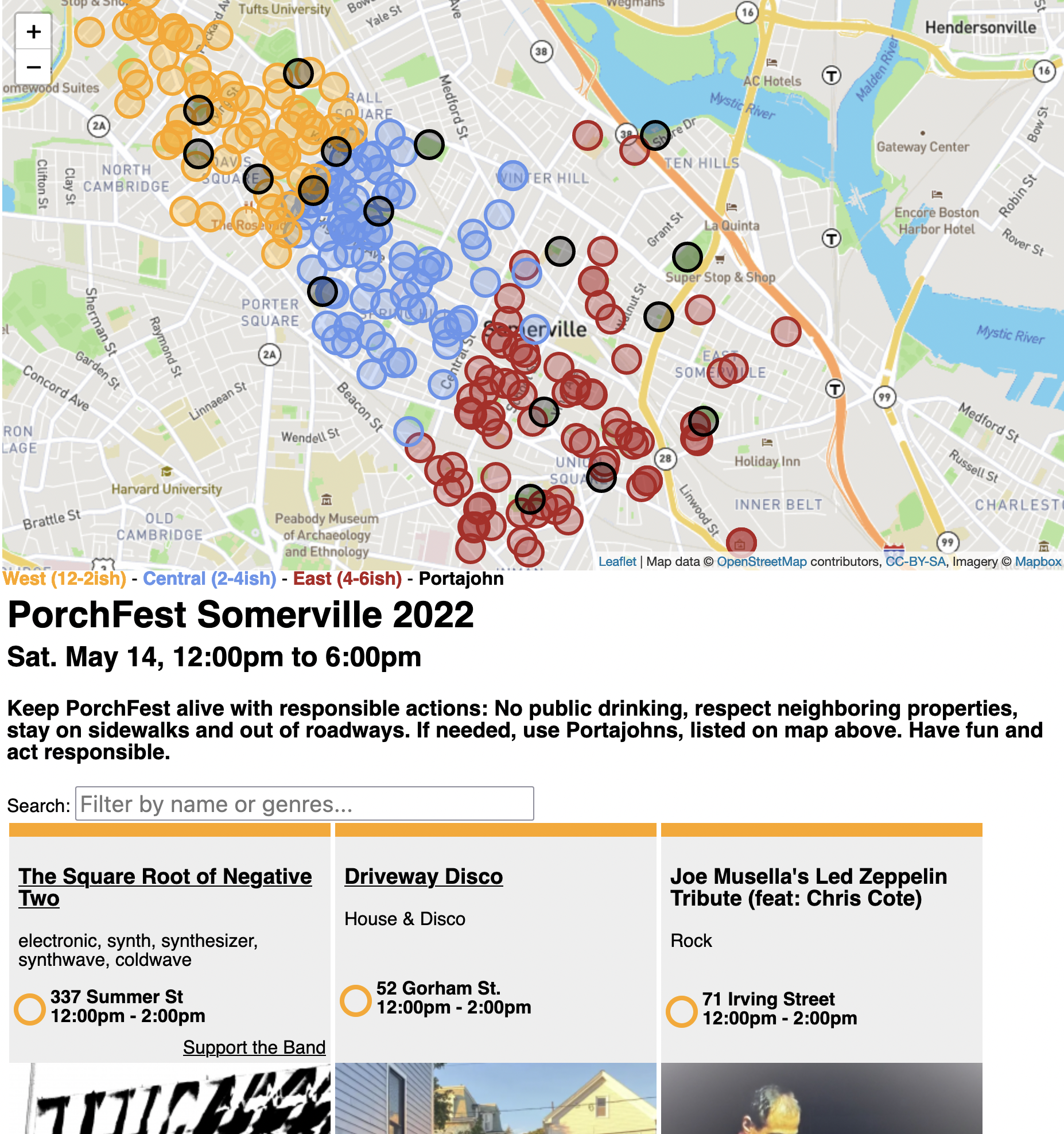
There was also a request that when the user clicked on a porch on the map, it should show the band below, since it's the band card that would have the photo I was worried how to make that work - there's already a filter for the name and genres, but treating it as "just another filter" and hiding all the OTHER band cards might just be weird. So I thought I would highlight the corresponding band card with a color, and scroll to it.
But because the map is perma-pinned to the top half , Element.scrollIntoView() didn't quite work - it didn't take the "sticky header" map into account and so scrolled up behind it.
Here's the code I ended up with:
const bandblock = document.getElementById(`bandblock${bandid}`)
bandblock.classList.add('open');
const elementRect = bandblock.getBoundingClientRect();
const absoluteElementTop = elementRect.top + window.pageYOffset;
const middle = absoluteElementTop - (window.innerHeight / 2);
window.scrollTo({ top: middle - 20,left: 0, behavior: 'smooth'});
The DOM element has an id based on the bandid, I added an "open" class to color it, then I do a little math to figure out the top of the element and use a smooth scroll to place it just a little lower than half way down.
No comments:
Post a Comment