Thursday, June 30, 2022

what's new in js

Heh, you know there are two things that tend to clog up my inbox (because I get stressed out and/or feeling like I should get to it later, but then it just sits) -recruiter contacts and Javascript newsletters.

My favorite of the latter are Frontend Focus and Javascript Weekly.

Here's some stuff that came up:

What's new in the 2022 ECMAscript standard...

Object vs Map. The thing is, I'm not sure devs are really willing to give up their syntatic sugar! I think that's why JS + JSON have been so killer, the concise syntax letting you put together arrays an objects with a minimum of fuss...

Defensive CSS seems pretty good and well-presented.

Tuesday, June 28, 2022

making pill tracking sheets in php

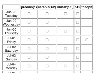
Our poor kitty Dean has a touch of small cell lymphoma (on top of his asthma) and his pill schedule has gotten pretty complicated! I decided to make a simple tool kirk.is/tools/pills/ that lets me (or anyone) make a printable pill schedule grid, ala:

(You can see Dean's full grid here)...

Like my recent quickpoll program, I decided to both keep it as pure PHP as well as relying a rather too geeky by half text-based format for the pill descriptors, each pill name can be followed by an @ sign to say how often (e.g. 2 for every other day, 3 for every third day, etc) and then a + sign and an offset for how many days forward):

everyday pill
every other day pill@2
every week pill@7
every 2 week pill, start in 5 days@14+5

I think I really need to build myself a generic form builder, while this text-block based stuff is cool in a minimalist way (and lets you copy and paste almost all the data in one fell swoop) it's not user friendly...

Anyway, other minor bits of cleverness is setting up the page to submit to itself via GET, so it's always bookmarkable, as well as using CSS media queries so when you print it's just the grid.

Thursday, June 23, 2022

worst java interviewee ever

In 2005 I posted this on my blog, quoted here for posterity:

A friend gave me a photocopy of a worksheet from a programmer job interview, the contents of which I'm transcribing here. Probably the worst interviewee experience I've seen. I've tried to be reasonably fair; arguably I should could be generous and use * in place of ·, since this was handwritten, but given all the absolute conceptual failures and mental disconnects, I'm leaving it as is.

So the interview "challenge" was to write a factorial function. Now, I don't know exactly how well or poorly the problem was described by the interviewer, but given the first line, probably copied from a whiteboard, I'm assuming it was pretty straightforward. Here's what the sheet had on it...most of the strikes are circular scribble-outs:

5! = 1·2·3·4·5

public string access(string 5! a)

{

  string

    string b = a.substring(0,1);

   string

    Int int c = b String.getValue(b);

    if(c < 2){

      System.System.err.println("1");

    } else if (c < 3){

      System.err.println("1·2");

    } else if (c < 4){

      System.err.println("1·2·3");

    }

For someone aspiring to a Java development position, and who must've sounded at least possibly decent on the phonescreen...supposedly the person has multiple masters degrees in science-y and computer-science-y fields, both from good local Universities.

For the non-techies on my blog I summarized the issues like this:

1. Returning a string? Already something seems a bit amiss.

2. Why name a function like this "access"?

3. Passing "5!" as a a variable name, even though struck out, is a telling mixup of variable name and content.

4. More string oddness. These two lines seem to indicate he's just trying to parse the first character of the String passed in to an int, ignoring the rest.

5. To the right of "c -", there's NOTHING about Integers...I'm willing to give him a pass in terms of specific function name (Integer.valueOf(String) would have "worked" as a replacement for String.getValue(String)) but he's not even in the ballpark.

6. The use of "if"s here, 3 conditional cases, is just an astounding example of misthink. Logically, only Strings starting with 0-3 will produce any output, and even then if it's a "one digit string" of the values 1-3 could this logic conceivably "work".

7. Finally, the use of "System.err" rather than "System.out" is just... well, wrong. Or maybe so right, a subtle bit of self-commenting on the error-ridden code...

An even half-way decent programmer when given this problem would likely think for a moment and then say "do you care if it's solved recursively or iteratively"? (With the latter being the better bet, performance wise, but that's a small issue). Also, this is kind of an "academic" problem, and the guy seemed to have a strong academic background...besides talking a *great* game about all the latest technologies, and getting some complex stuff about J2EE right. It's just really odd.



Wednesday, June 22, 2022

neumorphism we hardly knew ya

The rise and fall of neumorphism Hm. Never really got into it. I sorta like the way it looked, tho… but understand a11y issues are there. Also, I gotta think, plain old flat design is just easy to make :smile:

Thursday, June 16, 2022

ie, prounced "AIIIIIEEEEE!"

A not too fond farewell to IE, most unlikely member of the "27 Club".

It did have a good feel relative to Netscape when it first came out.

the desktop catchall

I'm looking forward to trying out MacOS's Stage Manager - even though I'm notably a little conservative about my daily driver UI, this seems like an interesting blend of what I used to prefer about the old Windows taskbar vs the MacOS Dock - that thinking in terms of "open windows" vs apps still makes a lot of sense to me.

One complaint from some people trying it is anything on the Desktop is hidden...

People. It's 2022. Stop using your Desktop as a big cluttered workspace!

(My life improved when I switched Mac to use ~/Download for ALL my temp workspace needs, especially AirDrop stuff. This alongside my even longer term pattern of using ~/data for all my personal data that I care about in the long term, rather than ~/Documents or whatever idiosyncratic local folder an app would prefer to use.)

still juicy after all these years


Sigh, I remember how I was the strong company advocate for "Juicy" UI... but I feel like they heyday for that was a decade ago. And it was a simpler thing back in the pre-Angular, pre-React days.... declarative programming is great, but its focus is on having the screen represent whatever structure in memory you have as efficiently as possible. It doesn't have as rich a language for how you get there... gradual transitions to that state are possible with CSS animation, but I don't think that's as expressive a paradigm as setting up animations in bad old jQuery.

So it was nice to see Daring Fireball link to The World's Most Satisfying Checkbox.

Of course juiciness is still around... I think of the Material UI Button that has a pleasing little sonar-looking ping spreading outward from wherever exactly the click or tap happened.

Still, it's not the priority it was. I mean sometimes transitions are nice for visual and mental continuity from one state to another, but mostly it's just fast, fast, fast. (Of course having to design for mobile without hover sensing, devices with possibly slow animation rates, and variable network times are other reasons most designers are not "Juicy first")

Tuesday, June 7, 2022

announced at wwdc

WWDC Recap - many things!

My two biggest takeaways: (having just skimmed it to be honest)

1. the "iPad has proper windows" things is hugely radical. I think more than anything, that has been what made a tablet feel different from a laptop (other than keyboard vs touch, I mean) The iPad really made its mark by being a supreme singletasker; taking the original "fondleslab" idea of smartphones that the iPhone established into a larger device, with the central metaphor that the machine BECOMES the app running on it, in a UX-meaningful way. Getting rid of that... boy is it a step. Like I imagine from a dev PoV, now they have to worry about different window sizes? (unless they just keep the landscape/portrait sizes consistent and scale as needed, I haven't investigated)

Like I'm not sure I like the change conceptually. But maybe the tablet was in a rut. My iPad is: 

  • an ebook reader
  • a light web-browser
  • a platform for this one drawing game I've been doing for years (DrawSomething)
  • a very occasional second touch screen for my mac
  • a more frequent "Find My" launcher to find my iPhone
and I'm not sure I would ever use it for more than that tbh - the old critique of "ipd is for consumption, laptop is for creation" is somewhat true. Maybe windowing will be a meaningful way of getting beyond that... but for now I'm sticking with laptops.

2. "customize your lock screen" (especially the font of the clock). Wow. This is lowkey one of the most-un-Apple things I've seen. I didn't realize how consistent a locked iPhone looked - how much identity it had - til i saw these samples of the alternate fonts etc, which hit my eyes as "oh that's android" ...and when I think about one friend of mine who changed the system font of her android phone to be serif... every screenshot I see makes me cringe a little. I mean it's the classic "Apple tries to prevent you from doing things in poor aesthetic taste" thing I'm wondering about.

form tag considered harmful

 Paul Ford asks The ‘Form’ Element Created the Modern Web. Was It a Big Mistake?

As anyone who has investigated the Windows control panels can tell you, there’s a lot of decades-old code in our systems. If people evolved like technology, you’d be 6,000 lizards, 30 chimps, and a couple Neanderthals all glued together with an anguished human face stretched across it as a “visual refresh.”

Hot take and interesting to ponder, but... well, the web as a "read-only-medium". Like that's half of what separated it  from gopher and ftp back in the day- one part was embedded links, but the other part was that potential for interaction...

Monday, June 6, 2022

minimalist polling ala doodle (and weirdness with mobile vs desktop views)

 I used to like Doodle polls, but it seems like lately they've been making things more complicated - the UI for coming in and indicating availability is just uglier than it used to be:


It used to always provide a simpler list of checkboxes, not this Outlook-wanna-be week view...especially horrible because if you're offering times for the next week, those options are even currently visible

Oh, update! I making screen shots I found out the old view still exists! It's just there at tablet and phone lists...


Well that's annoying! I guess I get the idea that desktop is somehow a "power user" mode? But for a damn "what day of the week should we meet" poll, it's way overkill. 

There are some other annoyances, like - it puts the organizer in as all green for dates, which isn't a good assumption for my purposes - sometimes I am setting up a band rehearsal I may not be able to attend.  And it asks for email just to add a response, which is obnoxious. And it doesn't make it easy for anyone but the organizer to see/share the responses so far.

That said, there are things I like about it - the "click once to say yes, click again to say 'if need be' is kind of clever" (I think people find it easy to use once it is pointed out to them). And I think it uses local storage or what not to allow responders to change their response, at least from the same device.

Still, I got an itch to try rolling my own - a very minimalist setup. I think I overshot on the minimalism, to be honest, but it is a usable first draft, and I might build an update to correct it.

The first minimalist choice was using barebones PHP and zero javascript. I admit some of that's driven by what's easiest to deploy right now on the VPS I rent. 

I think the most interesting (and probably regrettable) short cut was making an ad hoc, text-based format for defining a poll:

The first character on the line defines the entry type - in fact you can copy and paste that block into the textarea

! Heading
. Basic Text or Caption
_ Caption for Brief Text
@ Caption for Yes/Maybe/No
# Caption for Checkbox

It's kind of a nifty idea, but obviously limited. Like right now you can't say "this field is required" (which I learned the hard way would have been nice as I see people putting in "when I can meet" entries without putting in their name), and I do have visions of letting you ask questions with custom radio button responses. 

But it was easier than making a whole question builder UI right out of the gate! And I like that you could just copy and paste in a whole poll to reuse it. 

I simplified some things too much in implementation as well....like I decided to use the caption itself as a unique key, which led to datacleaning headaches. 

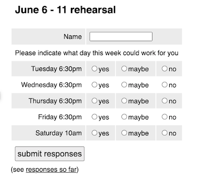
Anyway, the UI for responding was minimalist but clear:
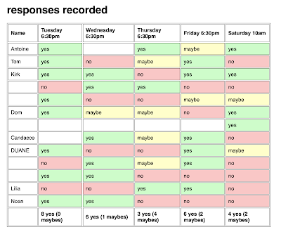
Similar for viewing the results:
Ugh, not having name be mandatory is frustrating. 

I wanted "clean" URLs, but I didn't want to to URL rewriting, so I made it so the root index.php file either displayed the homepage/create a poll or a specific poll, like https://kirk.is/quickpoll/?id=########## and then had subfolders for the main verbs, so stuff like https://kirk.is/quickpoll/results/?id=######### worked.

Anyway, a good usable proof of concept. 


Wednesday, June 1, 2022

fenway porchfest billboard

Surprised I missed writing this up before, but in 2018 Fenway Porchfest asked me to make up a digital movie for display on an electronic billboard facing Fenway Park... pieces slid in to form this:

Here's how the 2018 flavor looked over Lansdowne: 

Most of the visual ideas were by Katie L. who worked with me the first year.

I built a p5 canvas app to move the elements, with an option to download all the frames (I had to crank the framerate down, even on a fast machine it was skipping frame numbers...) I then used FFmpeg (after having to fiddle with the Mac security settings) to glue the frames together as an mp4:

./ffmpeg -i billboard%04d.png output.mp4

did the trick