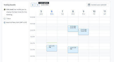
I used to like Doodle polls, but it seems like lately they've been making things more complicated - the UI for coming in and indicating availability is just uglier than it used to be:
It used to always provide a simpler list of checkboxes, not this Outlook-wanna-be week view...especially horrible because if you're offering times for the next week, those options are even currently visible
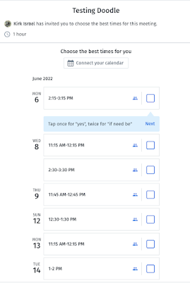
Oh, update! I making screen shots I found out the old view still exists! It's just there at tablet and phone lists...
Well that's annoying! I guess I get the idea that desktop is somehow a "power user" mode? But for a damn "what day of the week should we meet" poll, it's way overkill.
There are some other annoyances, like - it puts the organizer in as all green for dates, which isn't a good assumption for my purposes - sometimes I am setting up a band rehearsal I may not be able to attend. And it asks for email just to add a response, which is obnoxious. And it doesn't make it easy for anyone but the organizer to see/share the responses so far.
That said, there are things I like about it - the "click once to say yes, click again to say 'if need be' is kind of clever" (I think people find it easy to use once it is pointed out to them). And I think it uses local storage or what not to allow responders to change their response, at least from the same device.
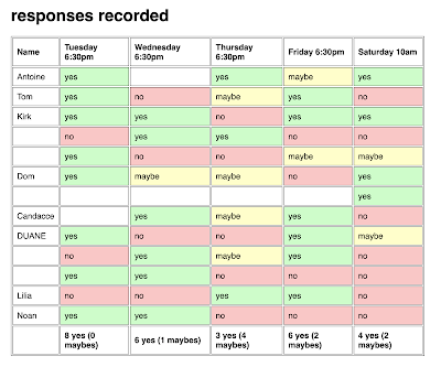
Still, I got an itch to try rolling my own - a very minimalist setup. I think I overshot on the minimalism, to be honest, but it is a usable first draft, and I might build an update to correct it.
The first minimalist choice was using barebones PHP and zero javascript. I admit some of that's driven by what's easiest to deploy right now on the VPS I rent.
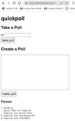
I think the most interesting (and probably regrettable) short cut was making an ad hoc, text-based format for defining a poll:
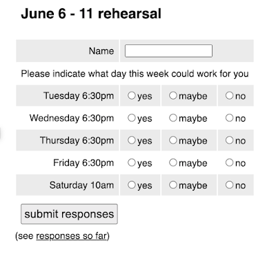
The first character on the line defines the entry type - in fact you can copy and paste that block into the textareaIt's kind of a nifty idea, but obviously limited. Like right now you can't say "this field is required" (which I learned the hard way would have been nice as I see people putting in "when I can meet" entries without putting in their name), and I do have visions of letting you ask questions with custom radio button responses.
But it was easier than making a whole question builder UI right out of the gate! And I like that you could just copy and paste in a whole poll to reuse it.

No comments:
Post a Comment