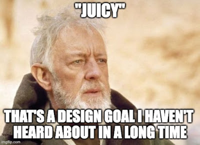
So it was nice to see Daring Fireball link to The World's Most Satisfying Checkbox.
Of course juiciness is still around... I think of the Material UI Button that has a pleasing little sonar-looking ping spreading outward from wherever exactly the click or tap happened.
Still, it's not the priority it was. I mean sometimes transitions are nice for visual and mental continuity from one state to another, but mostly it's just fast, fast, fast. (Of course having to design for mobile without hover sensing, devices with possibly slow animation rates, and variable network times are other reasons most designers are not "Juicy first")


No comments:
Post a Comment